Dulux Colour Awards finalists revealed
Our judges of the 38th Dulux Colour Awards have selected 83 finalists for their stunning design and architectural work from a record 527 entries across eight categories.
The Residential Interior category recognises excellence in the interior paint finishes of any building used as a private residence, including single and multi-residential projects.
The Commercial Interior – Workplace and Retail category recognises excellence in the interior paint finishes of any commercial or industrial building such as offices, studios, factories, retail outlets, pop-up retail and shopping centres.
The Commercial Interior – Public and Hospitality category recognises excellence in interior paint finishes of commercial or industrial buildings such as community centres, museums, theatres, places of worship, cafes, restaurants, fitness centres, hotels, event spaces, education and healthcare facilities.
The Commercial and Multi-Residential Exterior category recognises excellence in exterior paint finishes of any commercial, industrial, educational facility, multi-residential development and/or apartment building.
The Single Residential Exterior recognises excellence in the exterior paint finishes of a private single residence.
This new category recognises excellence in the interior and/or exterior paint finishes of any temporary, installation, exhibition, and brand promotion experience.
This category recognises paint specification by architecture or interior design students who are currently undertaking or have recently completed (within the past 12 months) a course by a recognised university or college.
This category celebrates excellence in paint specification by architecture or interior design students who are currently undertaking or have recently completed (within the past 12 months) a course by a recognised university or college.
This year's design trends
Dulux Colour Specialist Davina Harper provides insight into the recurring themes of 2024.
Earthy colours dominate
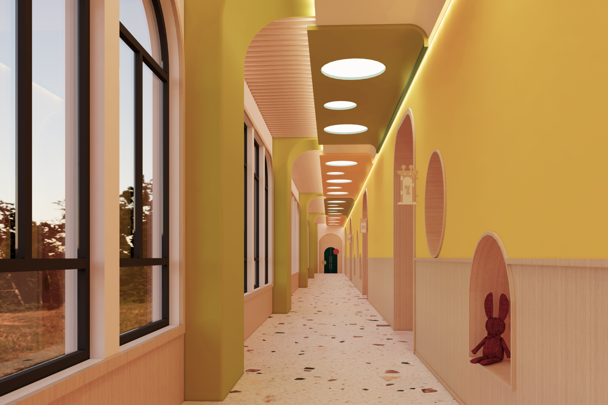
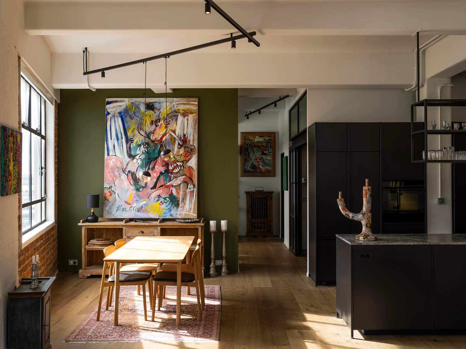
This year, biophilia – the affinity of humans with the natural world – is a strong theme, with earthy colours playing a dominant role in interiors. Olive greens, warm greys, muted taupes and dusky blues are coming into their own across several categories.
Eye-popping hues
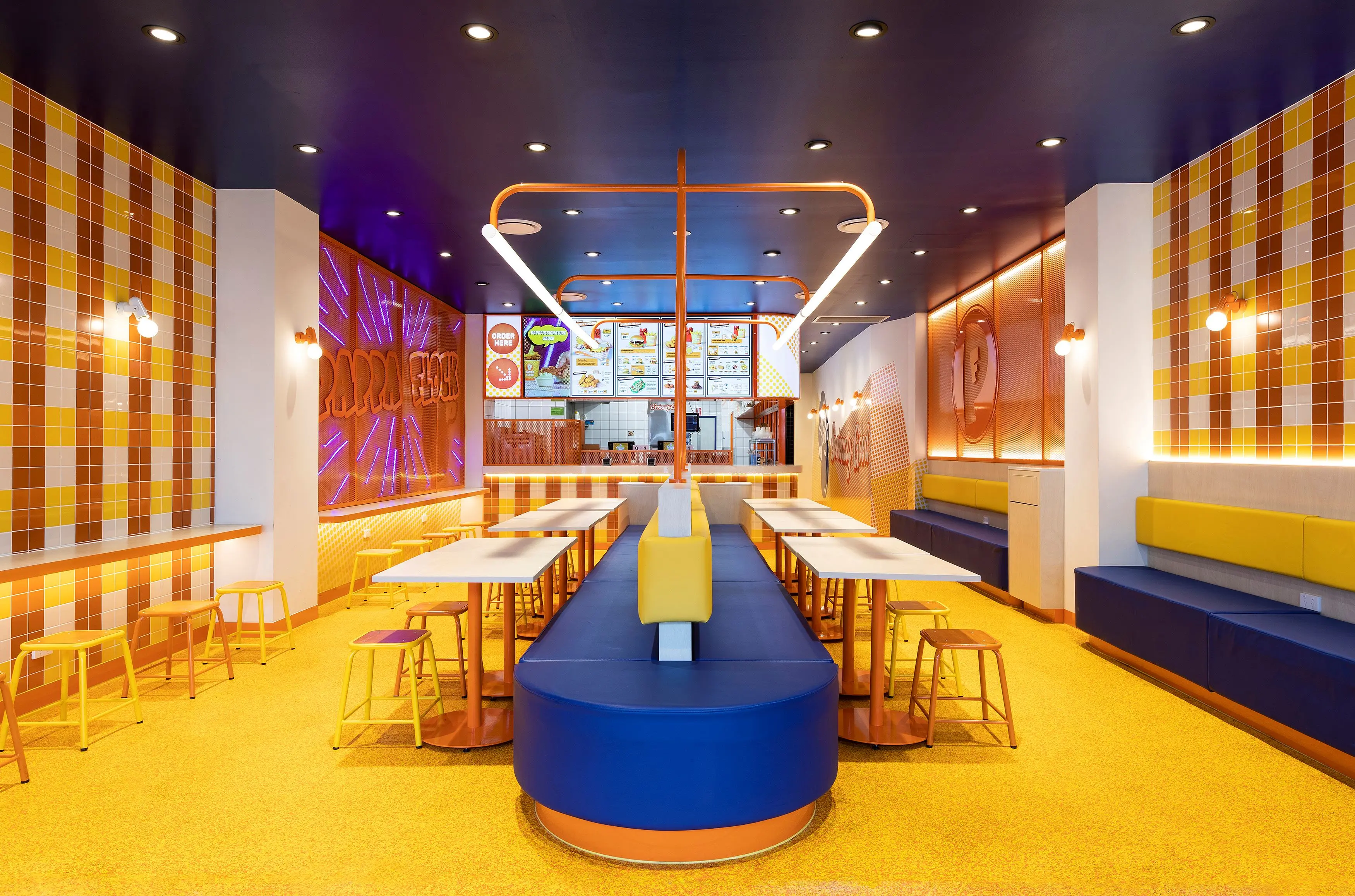
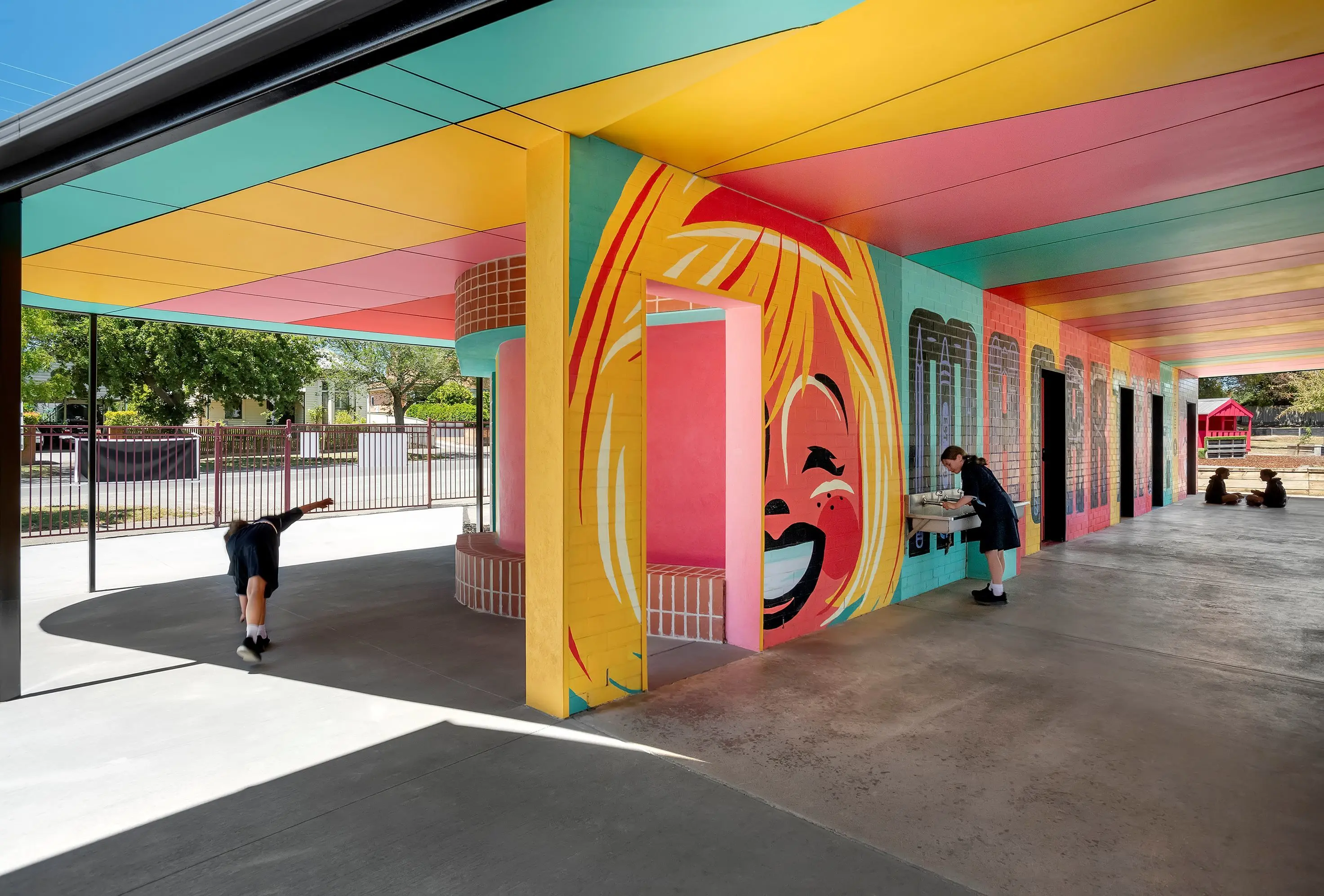
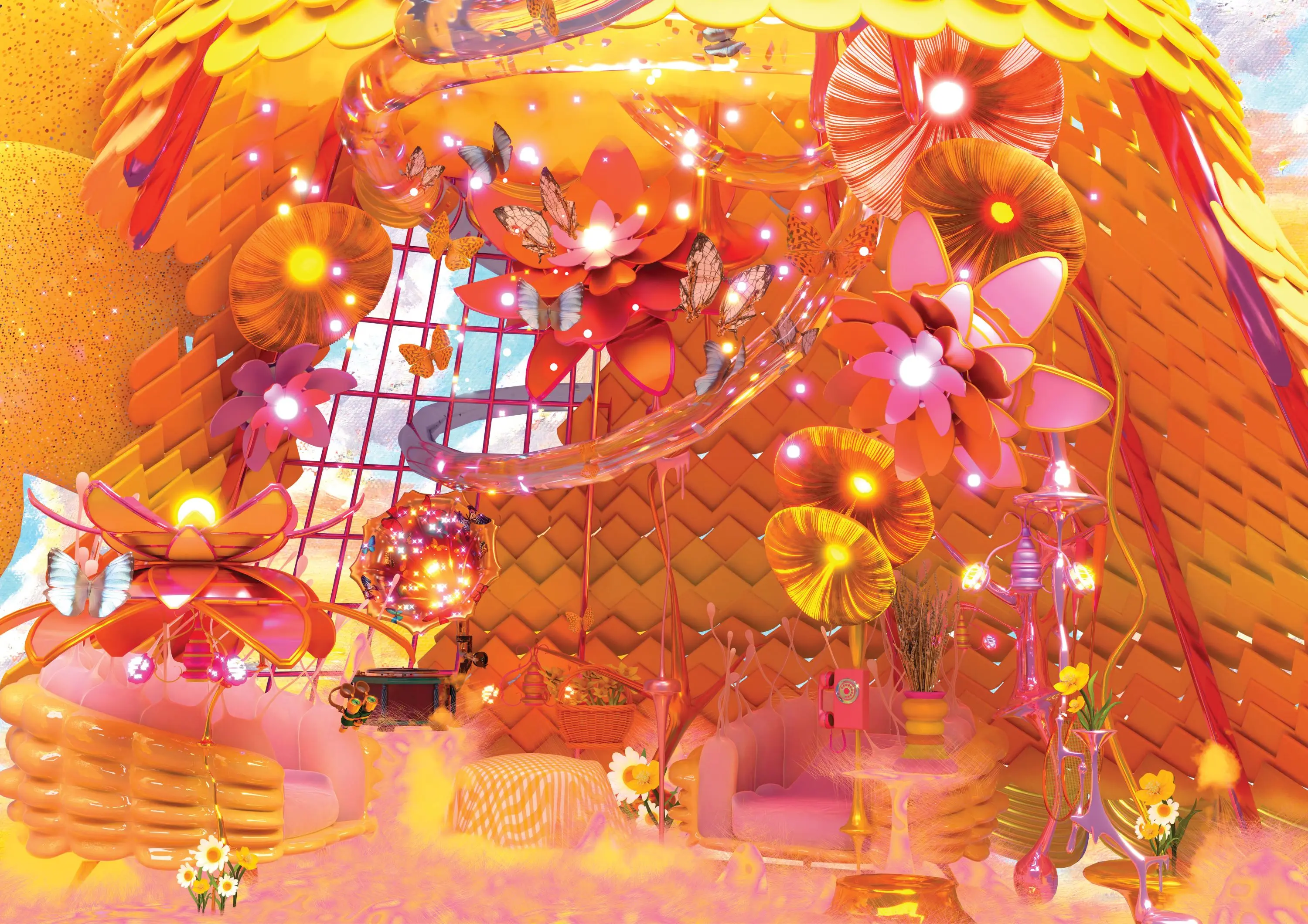
The bold use of saturated candy-like colours, clashing and contrasting against one another in projects of all types is an uplifting trend that shows a newfound optimism and confidence to try unexpected combinations for surprising and fun spatial impact and use paint colours that epitomise playfulness and joy.
Warm whites and soft beiges return
Spanning textured sand, through deep buttery cream to crisp chalky porcelain, this palette is being explored fully in innovative, layered applications. Gone are the days of a single white or beige being specified for an interior. Now, nuanced shades of a colour are being used to create highlights, details and contrasts within the one project.
Exteriors step out
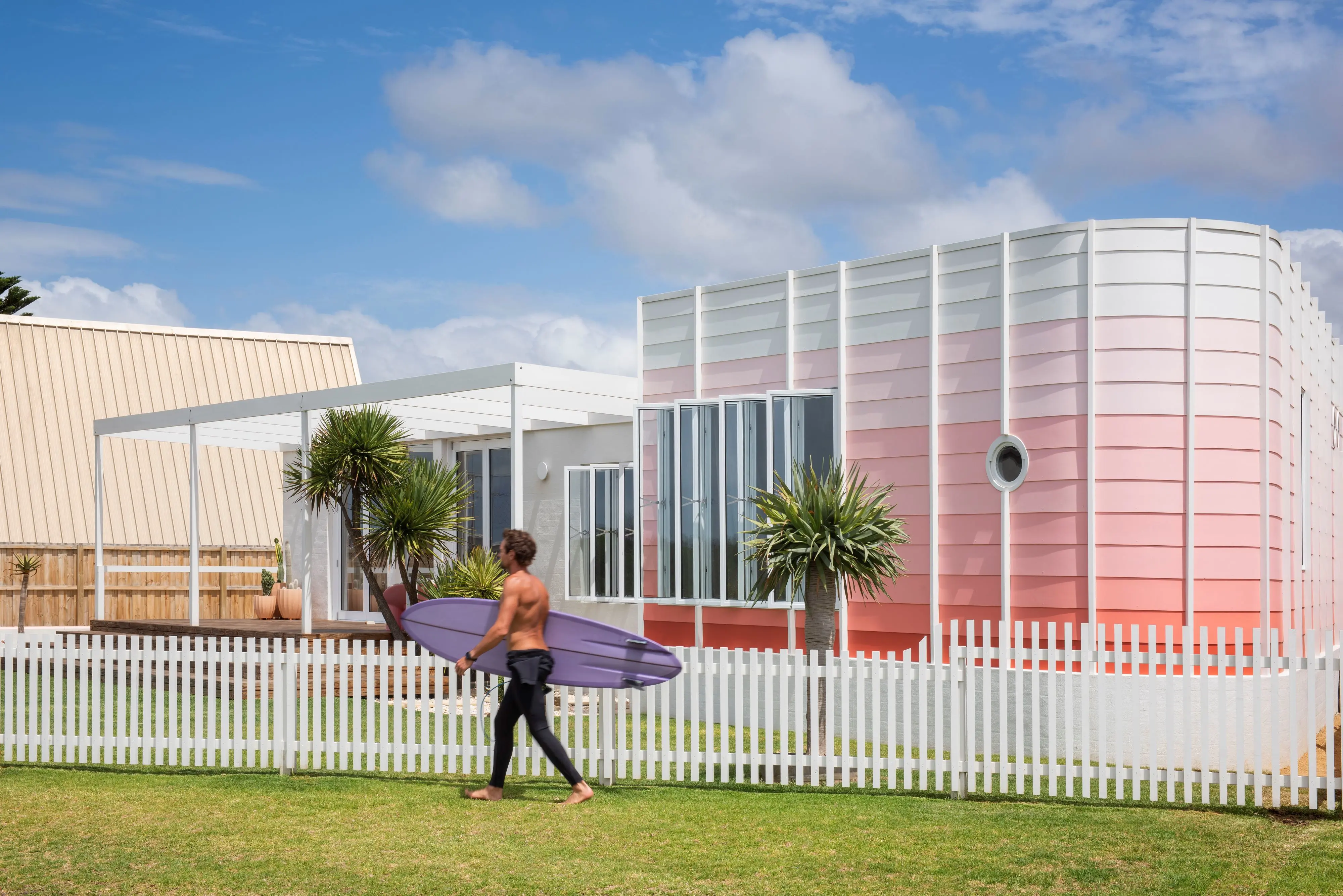
Exteriors are being used as canvases for all-encompassing tonal treatments, not only in pale neutrals, but other singular hues, resulting in impressions of shade, light and depth across elevations. We’re also seeing bold graphics and murals in external applications, surprising contrast colours of pinks and blues, and a lot of textural effects.


