Commercial Interior – Workplace and Retail
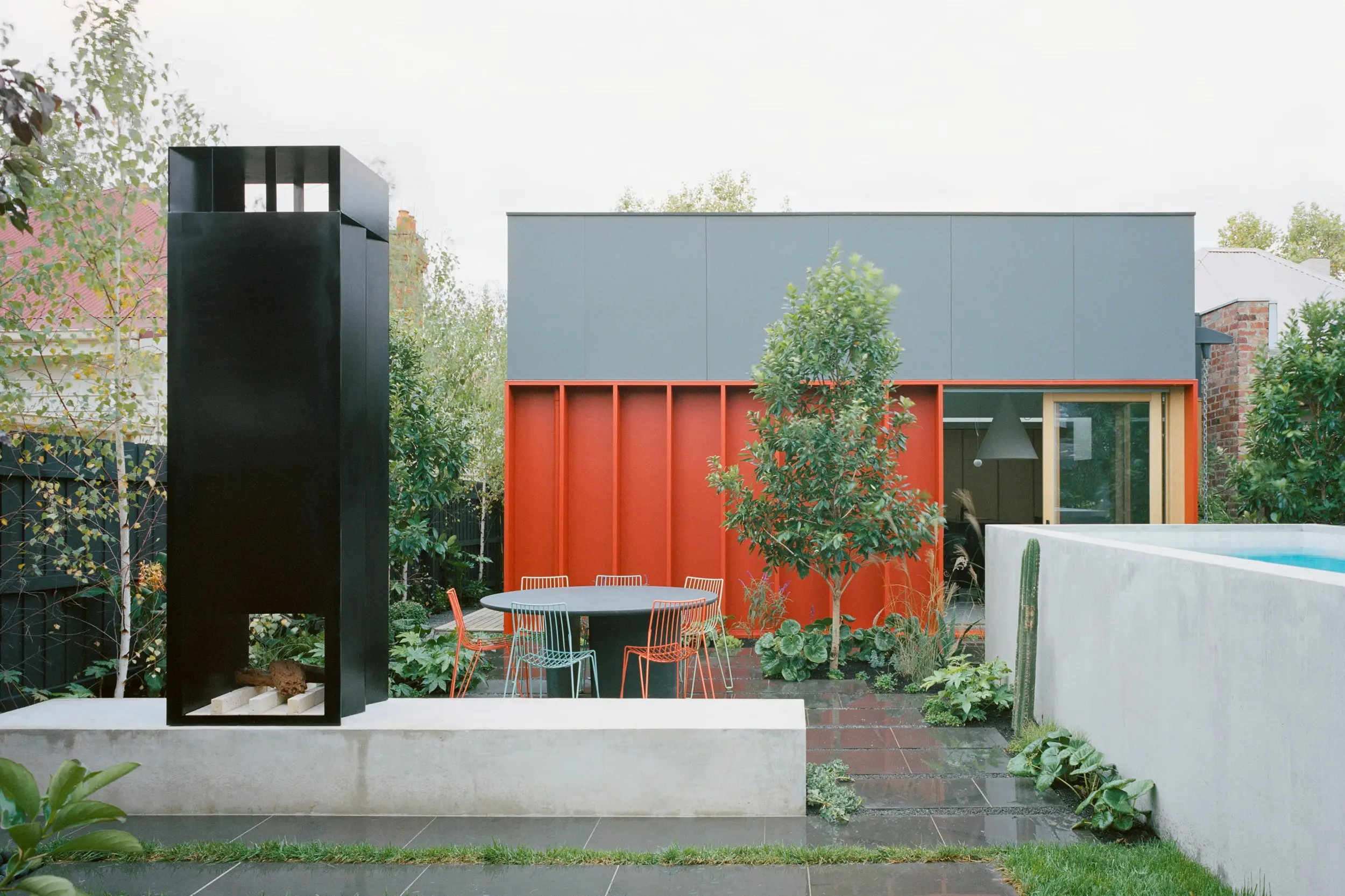
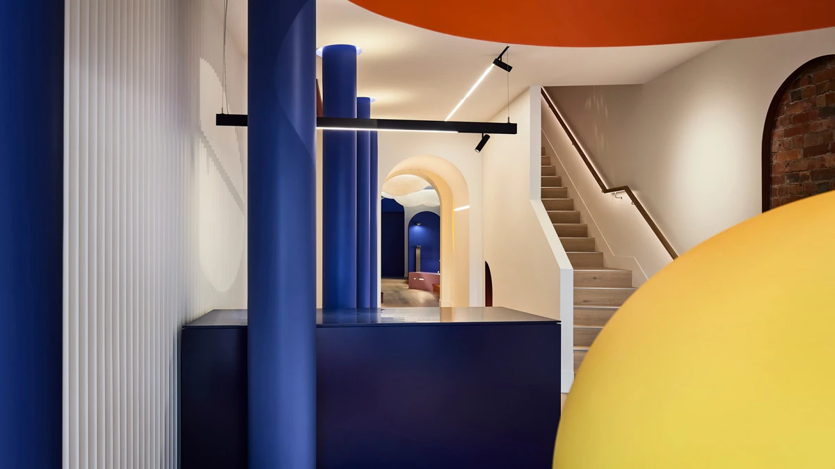
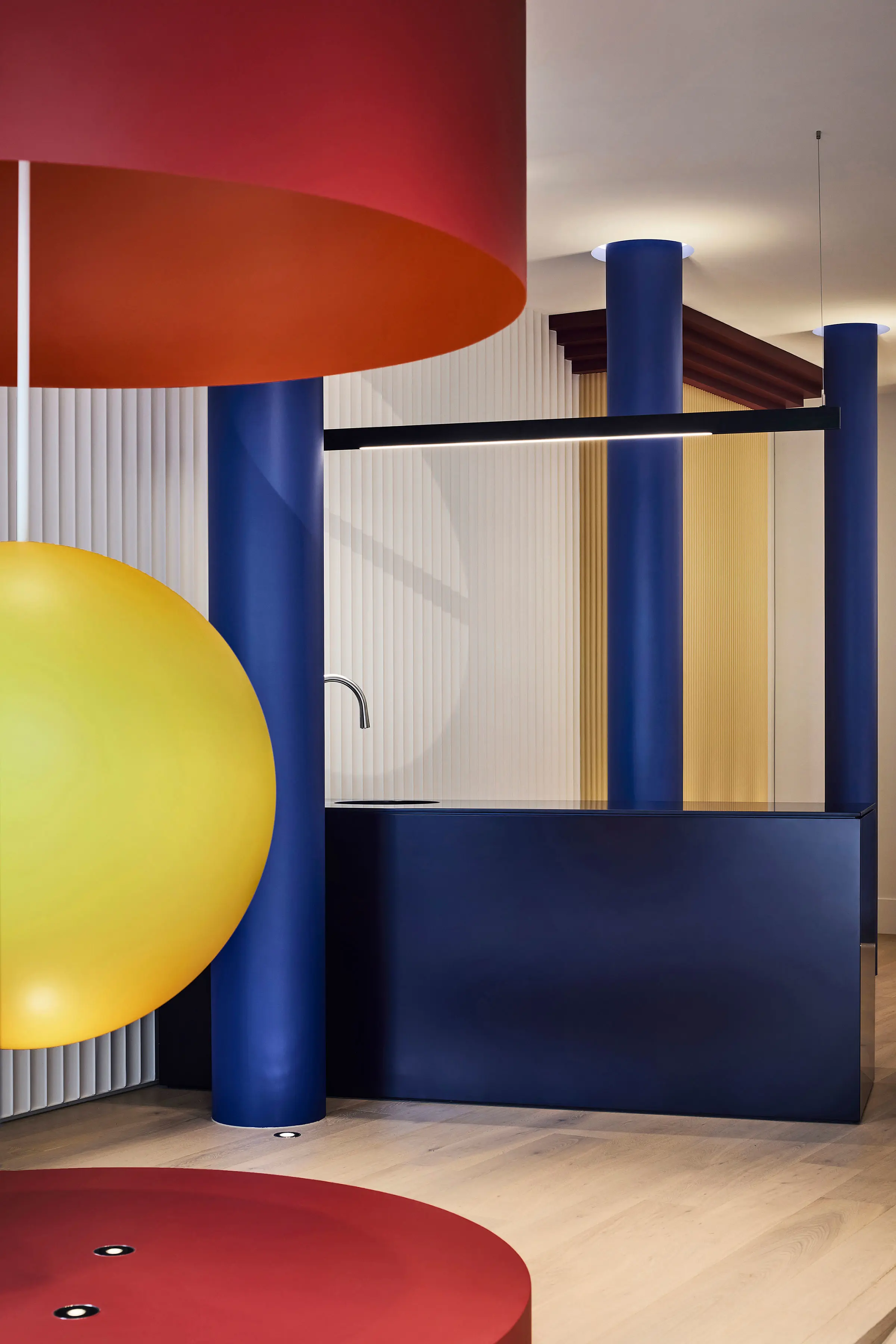
The Dulux Colour Awards 2022 Commercial Interior – Workplace and Retail category award recognises the best interior paint finishes of any commercial or industrial building such as offices, studios, factories, retail outlets, pop-up retail and shopping centres. Category winner: IF Architecture for Lux FX lighting showroom. Photograph: Sharyn Cairns.


IF Architecture for Lux FX lighting showroom, Melbourne.
About
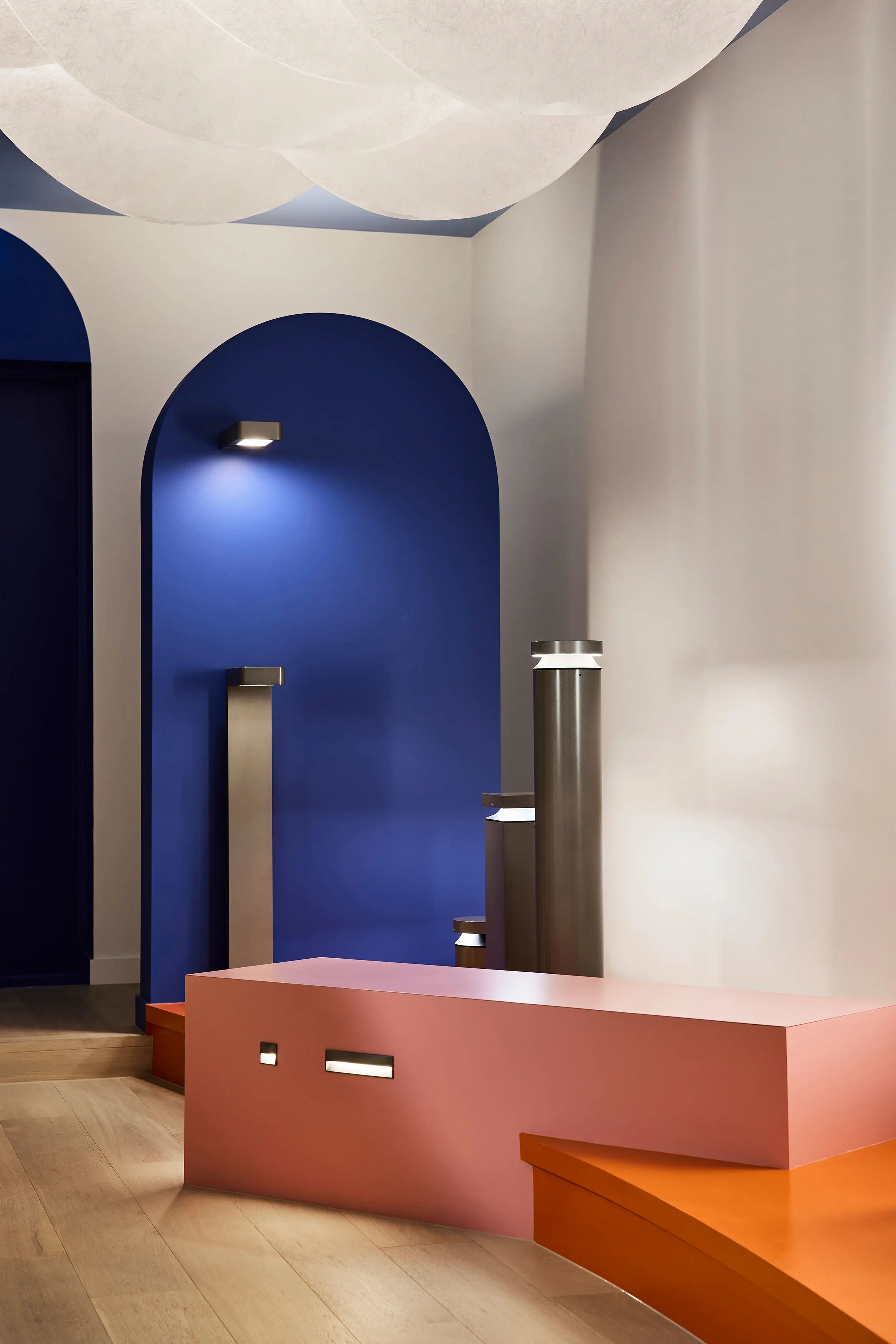
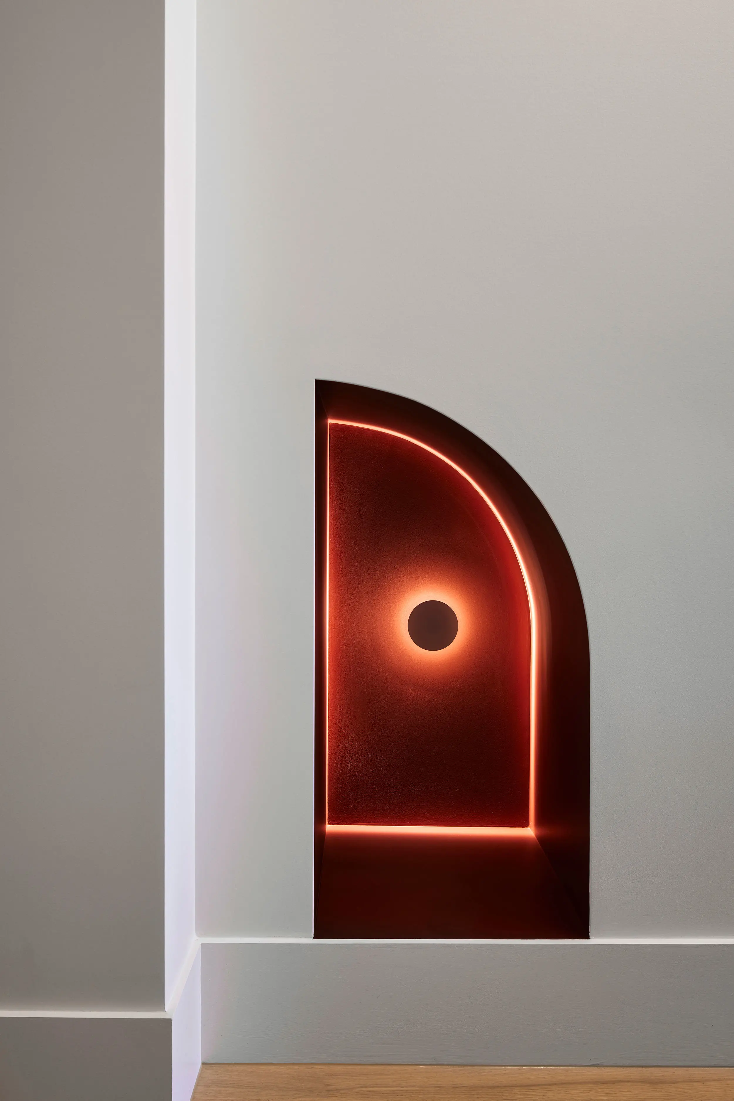
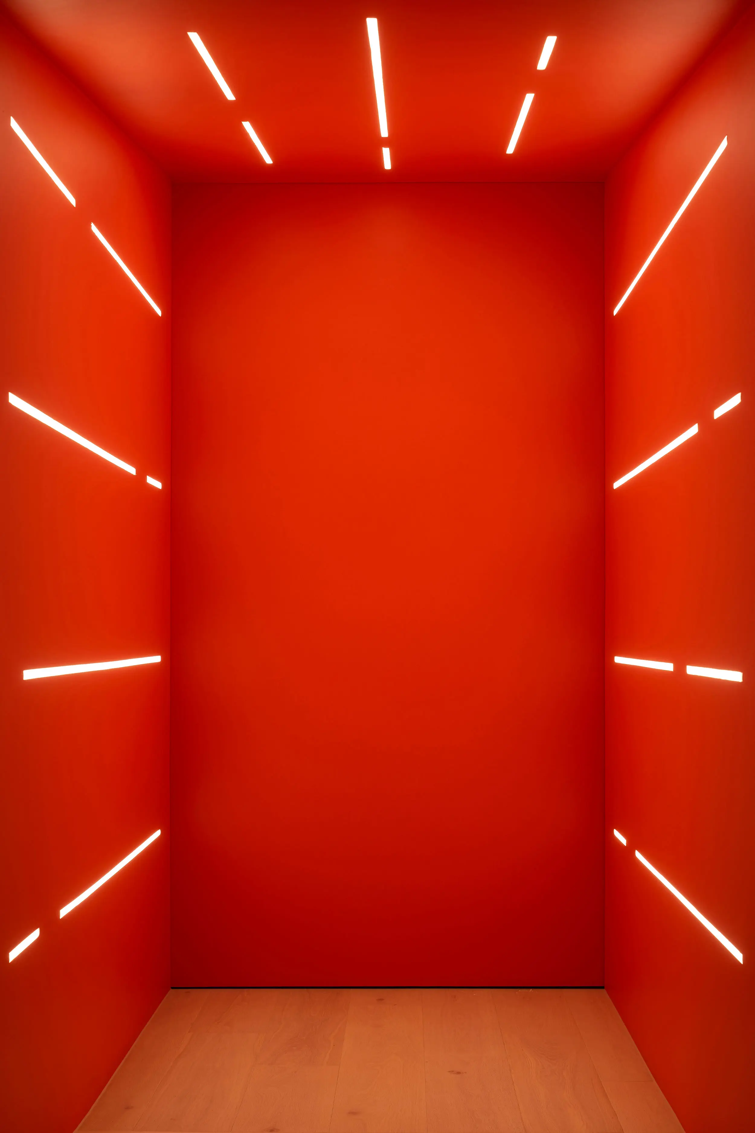
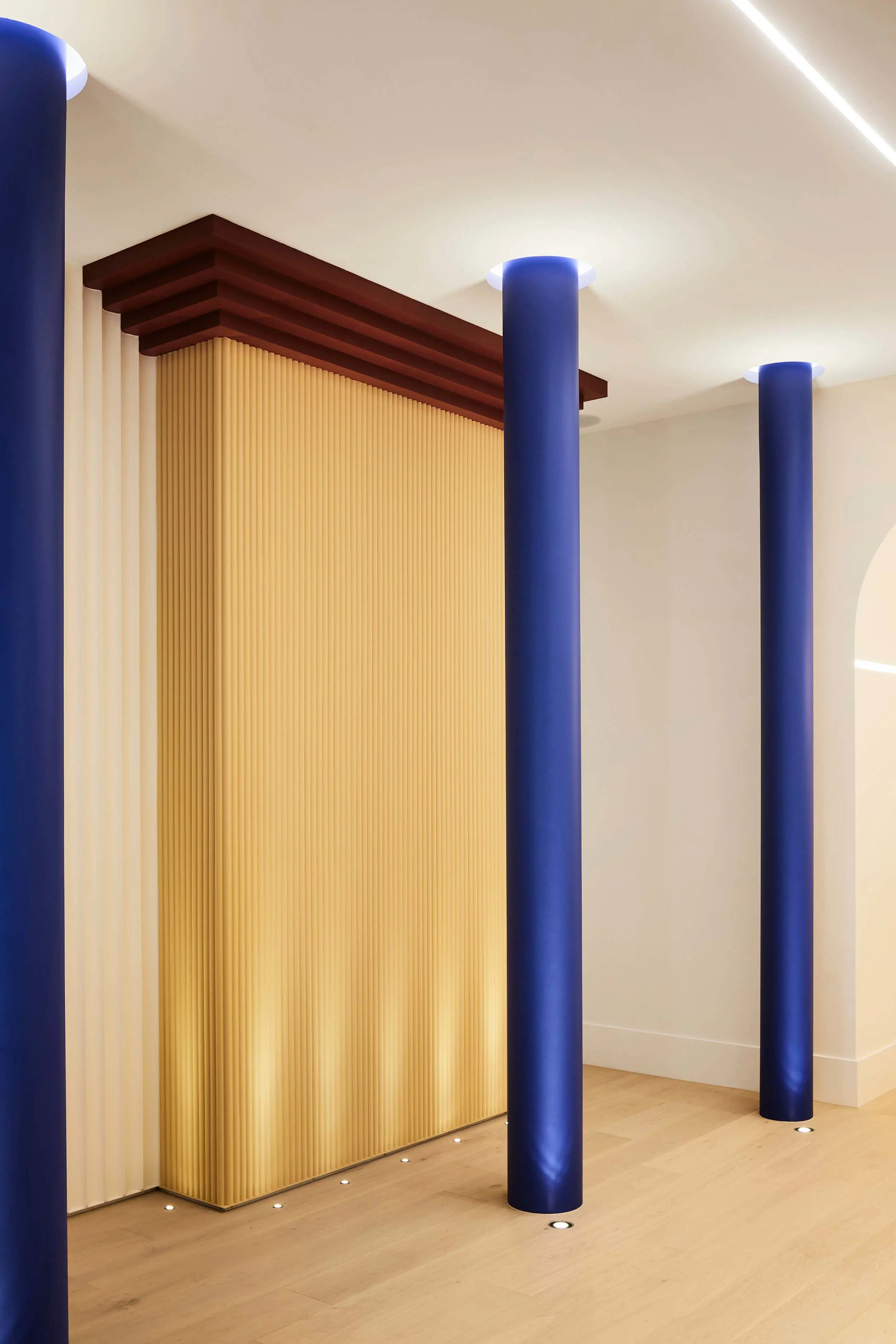
IF Architecture was inspired by Le Corbusier's use of primary colours to combine light, colour and form to create a retail showroom for Lux FX customers. This store has been designed as a sequence of coloured architectural motifs that when viewed together create a space reminiscent of a surrealist landscape, engaging with and celebrating the lighting products on display.
Dulux products used throughout this project included Acratex® RenderWall and Acratex® 955 Acrashield, Professional® Acrylic Sealer Undercoat, Wash&Wear® Low Sheen, Professional® Ceiling Flat White, 1Step® Prep Water Based Primer, Sealer & Undercoat and Duralloy® powder coating.
What the judges said...
“In response to this showroom, where primary colours meet primary forms and the confident use of colour is as functional as it is evocative, we were unanimous: it is a highly successful, surprisingly nuanced project. Its post-Modern or early Memphis–movement aesthetic creates a surreal effect, particularly the collection of large 3D architectural motifs on the ground floor. The bold colour-blocking of the columns, spheres and cubes initially appears simplistic, but is in fact strategically crafted to cleverly showcase the cutting-edge collection of lighting brands and products within. Such original design reflects the innovative Lux FX brand and its clientele of design professionals, who will appreciate the nuanced layering of non-primaries, the burgundy, pinks and pastel yellows, and the play of light and shadow upon them.”
The winning palette
Be bright, bold, and confident with a palette of eye-catching, strong colours that will level-up any area from main walls, feature walls and accents right down to the smallest of details.
Gallery


Commendation
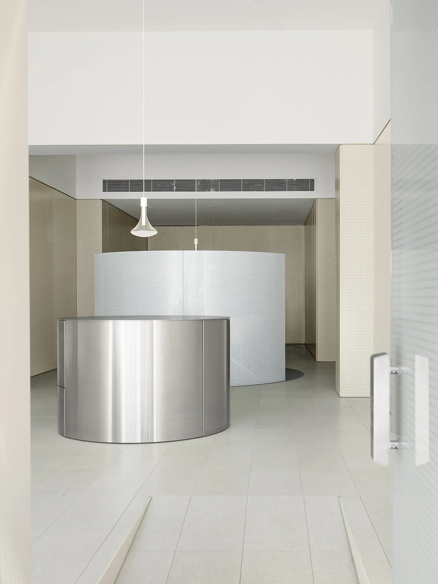
Chris Connell Design for Money Bar, Melbourne
What the judges said...
“An elegant restraint of colour typifies this project, but not usually this typology, namely a financial institution. In contrast to the often bland, dark workplace interiors of the genre, this is imbued with light, smoky tones upon a minimal material palette of stainless steel, terrazzo and glass. The resulting interior conveys a message of sophistication, stability and transparency, which, let’s face it, are all qualities we want in our financial institutions, as much as our workplaces,” she says. “It feels safe yet open, innovative yet trustworthy – a remarkable effect created so simply through the considered use of colour.”
