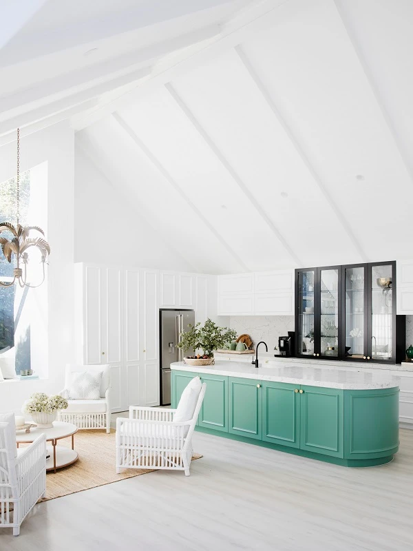
White on White™


White on White™
Sometimes the slightest variation can make all the difference. Compare White on White™ to other similar colours in our range.
Mt Aspiring
Lexicon®
Lexicon® Quarter
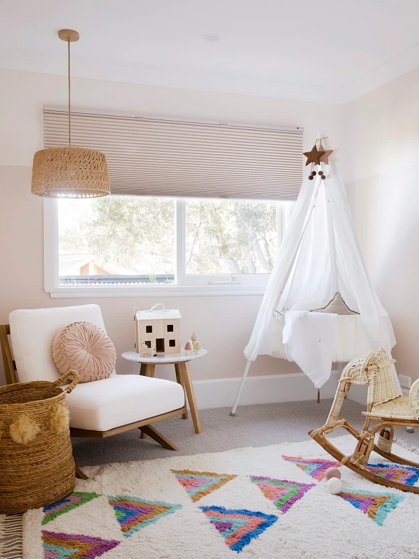
Check out this popular colour scheme that pairs well with White on White™ to get inspiration for features, accents and trims.
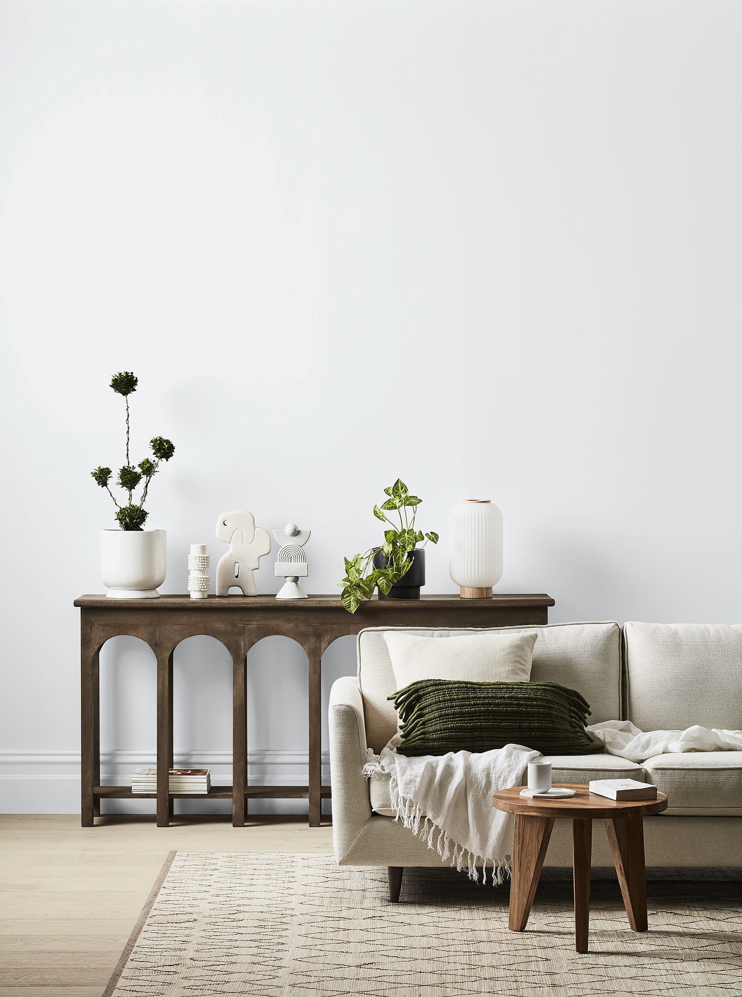
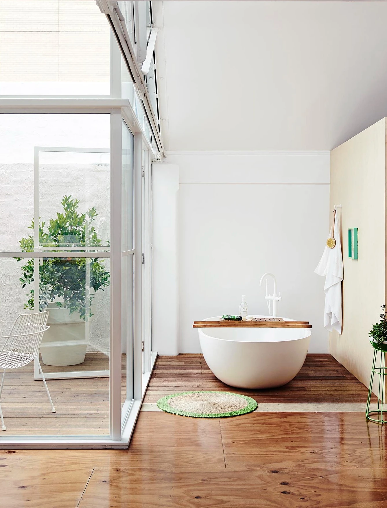
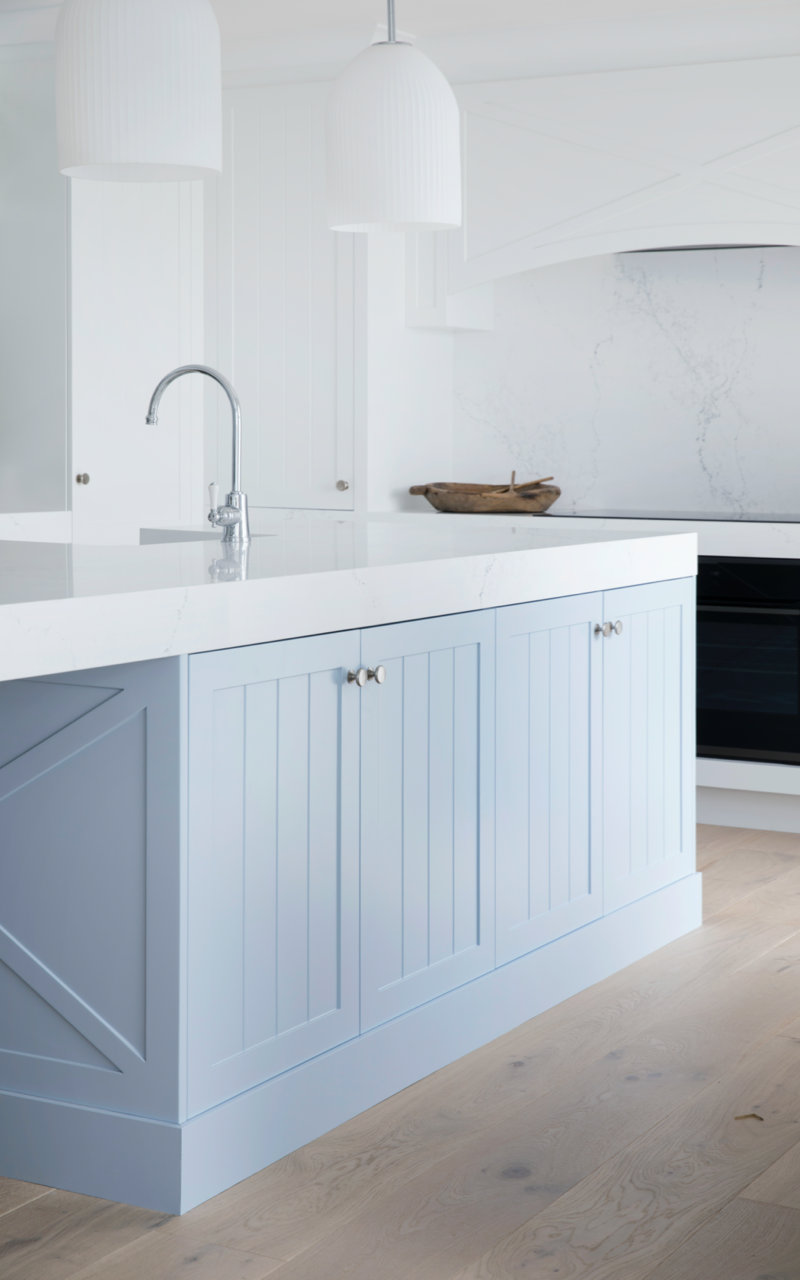
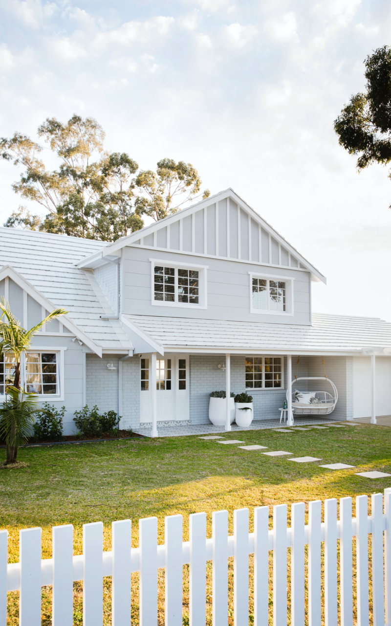
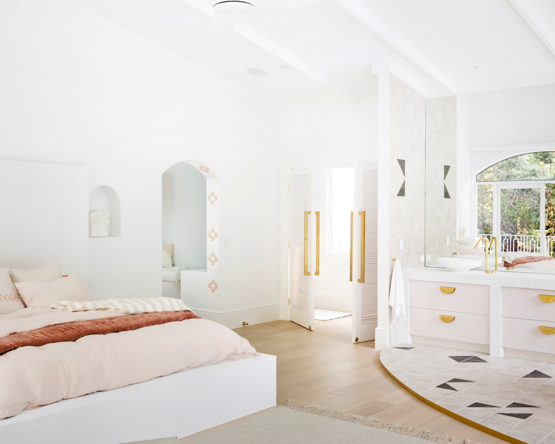
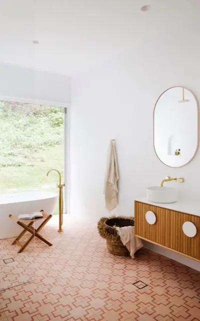
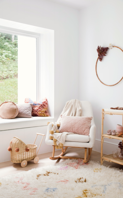
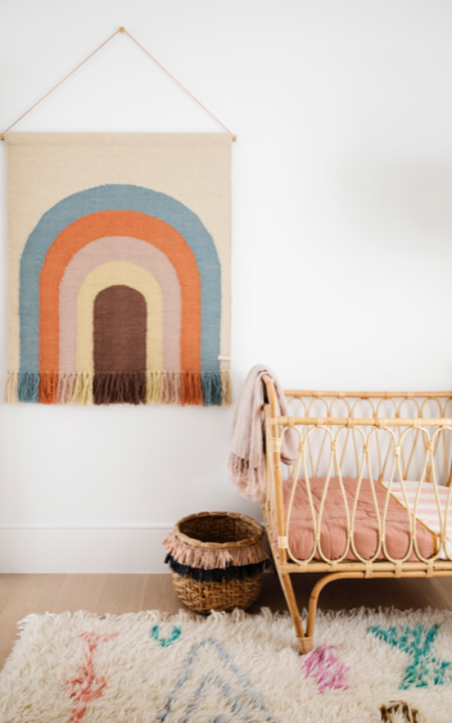
White on White™ pairs well with
Lime Sherbet Half
Soft Satin Quarter


Colour tips
With literally thousands of Dulux colours to choose from, finding the right one can seem complicated. There are a few things to watch out for when you make your selection.
Temperature
Cooler colours have hints of blues and greens, and are designed to calm and soothe. Warmer colours like reds and oranges add vibrance and life. Cooler colours appear to recede, adding visual enlargement, where warmer colours draw attention.
Lighting
The way your room is lit impacts the way the colours in it will appear. It is always best to test colours in natural light at various times throughout the day, as well as at night with artificial lighting incuding downlights and lamps.
Tone
One of the most transformational aspects of colour, tone refers to lightness or darkness. Tone adds form and shape to objects, and can alter our perception of a space, making it appear smaller or larger.
Surrounds
Paint can absorb properties of the things around it. Red brick exterior walls, vibrant gardens, and brightly coloured furniture and artwork can bring out the undertones in paint colours, and can change the way they look in your space.
Make confident decisions about your project needs with support from our wide network of colour and product specialists, tools, programs and apps — or chat to one of our expert consultants now.


Imagining how a space will feel in a new colour scheme is hard. Save time and gain colour confidence the smart way with personal guidance from an expert Dulux Colour Consultant.
Learn more-->
Have you got the vision but need some help with application? Connect with the right local painter to suit your needs.
Find a painter-->Explore more than 1000 colours from the popular Colours of New Zealand range.
Ask an expert. Use LiveChat to speak to one of our consultants for help about colour, products, projects and more.
Get in touch with our local Customer Service team, available to assist with colour, product and service questions.
Disclaimer
Colours displayed should be used as a guide for your colour selection. To ensure best accuracy, test your colour choice at home by ordering Dulux Sample Pots and Large Colour Swatches.

