
Power of unexpected colour in a heritage home
Be bold and brave
We can often feel limited to 'safe' shades when decorating a period home, gravitating towards neutrals such as warm whites, creams and beiges, perhaps with sparing use of the occasional deep accent colour, such as a heritage green or maroon!
In fact, heritage homes provide the perfect backdrop for a braver use of colour. After all, period architecture often means high ceilings and dramatic design details, such as intricate fretwork and cornices. All of these elements make for spaces that benefit from deep, moody and sometimes unexpected uses of bold colour.
Contemporary and traditional
In this renovated 1900s home, dusty pink has been used to add warmth and intimacy to the dining room. Used on the walls, architraves and across the mantlepiece, this deep complex pink is the perfect balance of contemporary and traditional. Achieve the look with Gouland Downs.

Classic consistency
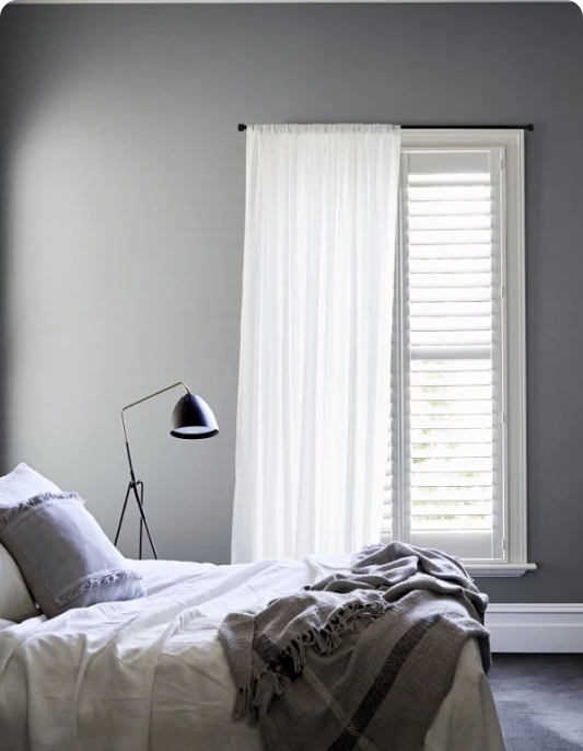
Grey is a classic shade that just never dates, and it doesn't get more timeless than Franz Josef! In this beautifully renovated Victorian home, Franz Josef provides a versatile backdrop, seamlessly weaving together heritage architectural features with contemporary furniture and design.
In this space, a consistent use of the same grey across walls, architraves, ceilings, window frames and even the radiators brings this heritage into the modern day. Conversely, for a more traditional feel, opt for ceilings and architraves in a contrasting white such as Mt Aspiring Half.

Linking the past and present
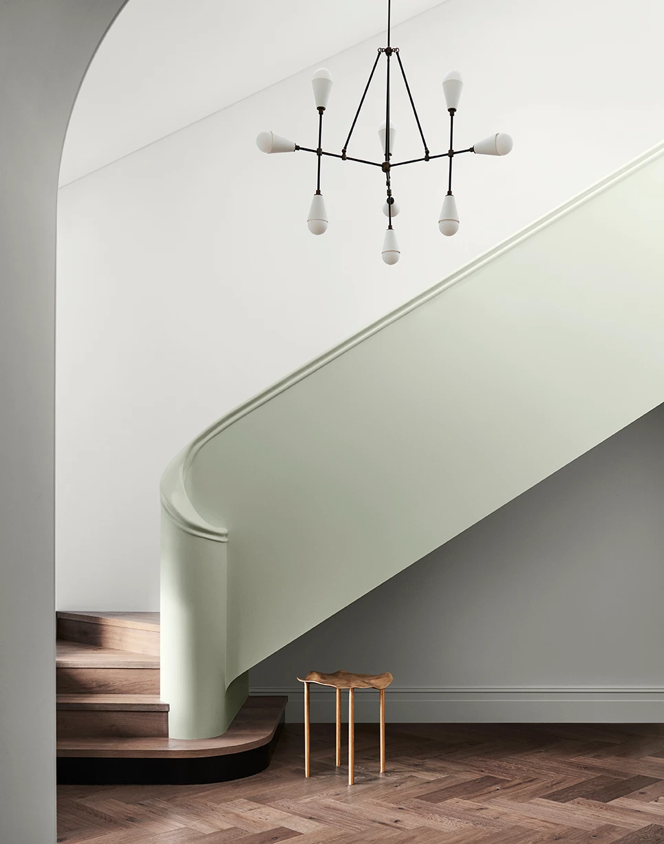
This grand home weaves together a myriad of inspirations, from Wes Anderson film sets, to Art Deco architecture, and even Mediterranean patterns. Anchoring these diverse influences is a calming palette of chalky whites and the delicate green of Willow Flat on the walls.
In this space, colour acts as a bridge between different architectural influences, complementing the home's heritage details, alongside its contemporary architectural flourishes.

Calming character
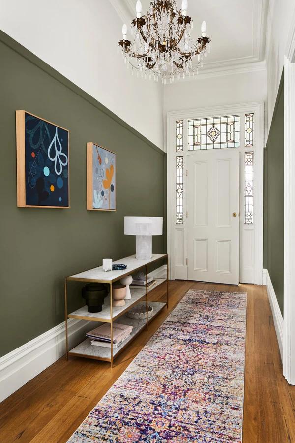
In this layered Victorian-era home, a soft sea green provides depth and character to the front rooms, whilst also acting as a rich backdrop for a stylist’s eclectic collection of artwork and objects. With its high ceilings, this sitting room benefits from a rich, deep palette, whilst the blue-green undertone provides a sense of calm. Try colours such as Tauherenīkau or Remutaka Range.


Discover your own style...
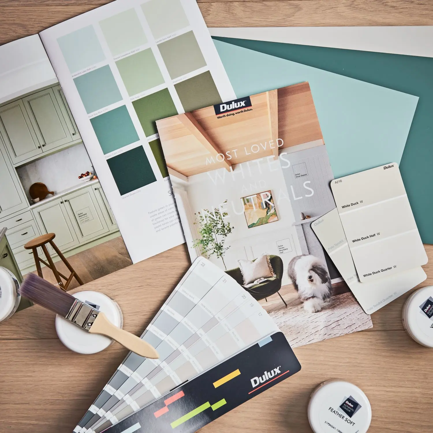
Deciding on the right colour can be difficult. To help you take on your next painting project, order a sample pot or A4 colour swatch to see your colour at home.
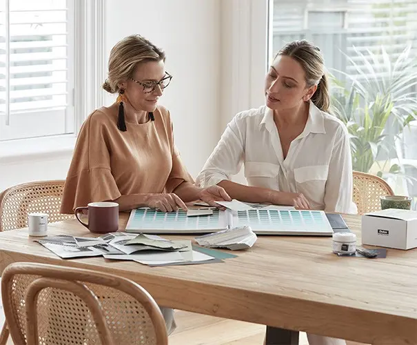
Dulux expert colour designers take their knowledge of all the latest trends and timeless colour schemes to help bring your home to life.

Our expert support team can help with everything from choosing colour, what product is the most appropriate for your job or troubleshooting when something hasn’t gone your way.
Disclaimer
Colours displayed should be used as a guide for your colour selection. To ensure best accuracy, test your colour choice at home by ordering Dulux Sample Pots and A4 Colour Swatches.

