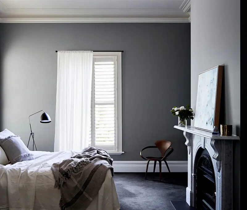
Contrasting Colour Schemes
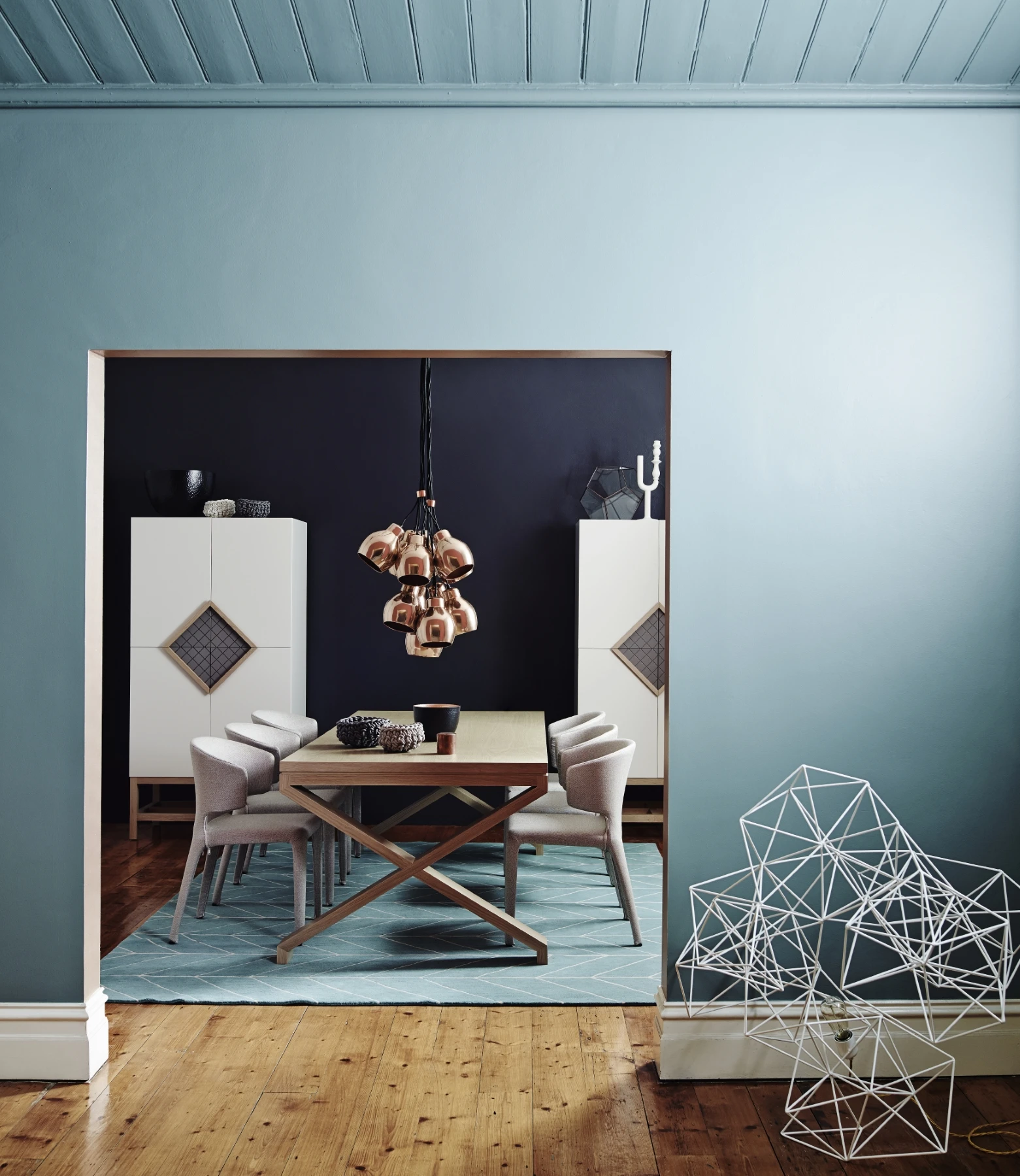
Colour schemes are visually appealing combinations of colour that create different moods and atmosphere in your space. Colours featured: Franz Josef (wall) and Cardrona (trim)
Follow 3 easy steps to get you started.
Monochromatic
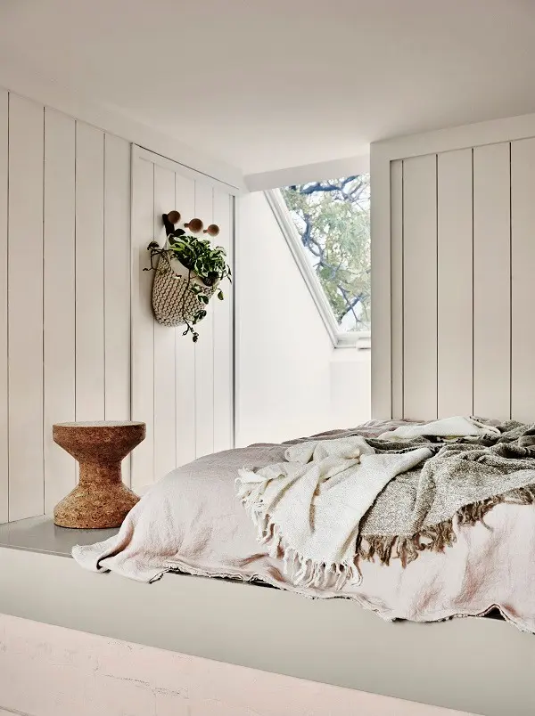
Monochromatic schemes are serene and relaxing. Light tones create a relaxed delicate feel, whereas dark tones can feel moody and dramatic. Mixing light and dark tones adds interest and a touch of energy.
Designer Tip
The use of contrast, texture and pattern help to give monochromatic schemes life and interest.
Harmonious interior scheme
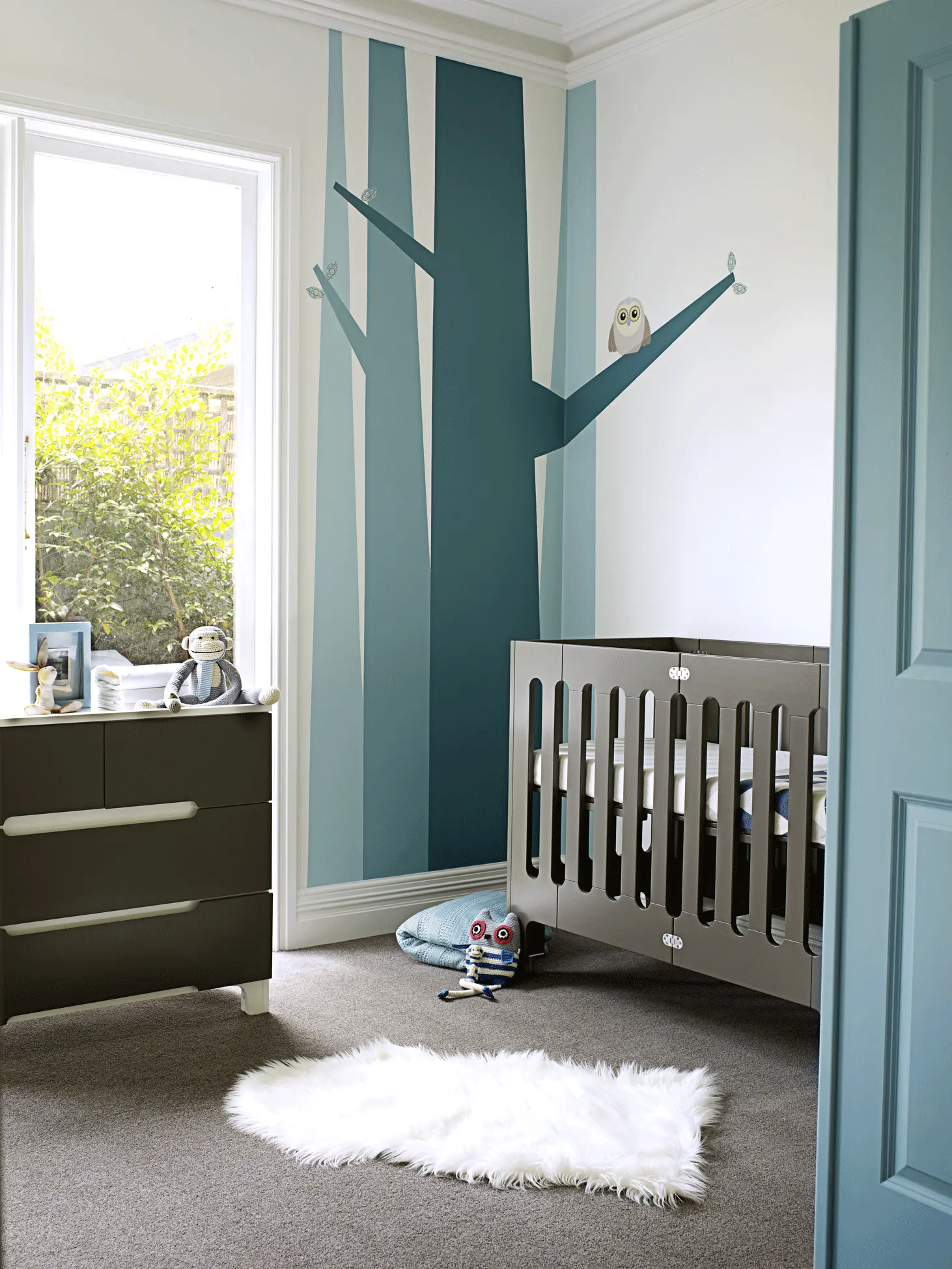
Harmonious scheme uses adjacent colours on the colour wheel. Harmonious schemes are often comfortable and relaxing, but generate more energy in a space than a monochromatic scheme. This type of scheme is great for those who want to have a play with colour but are a little hesitant about being too bold.
Designer Tip
The closer the colours are on the colour wheel, the more harmonious the scheme will feel.
Contrasting
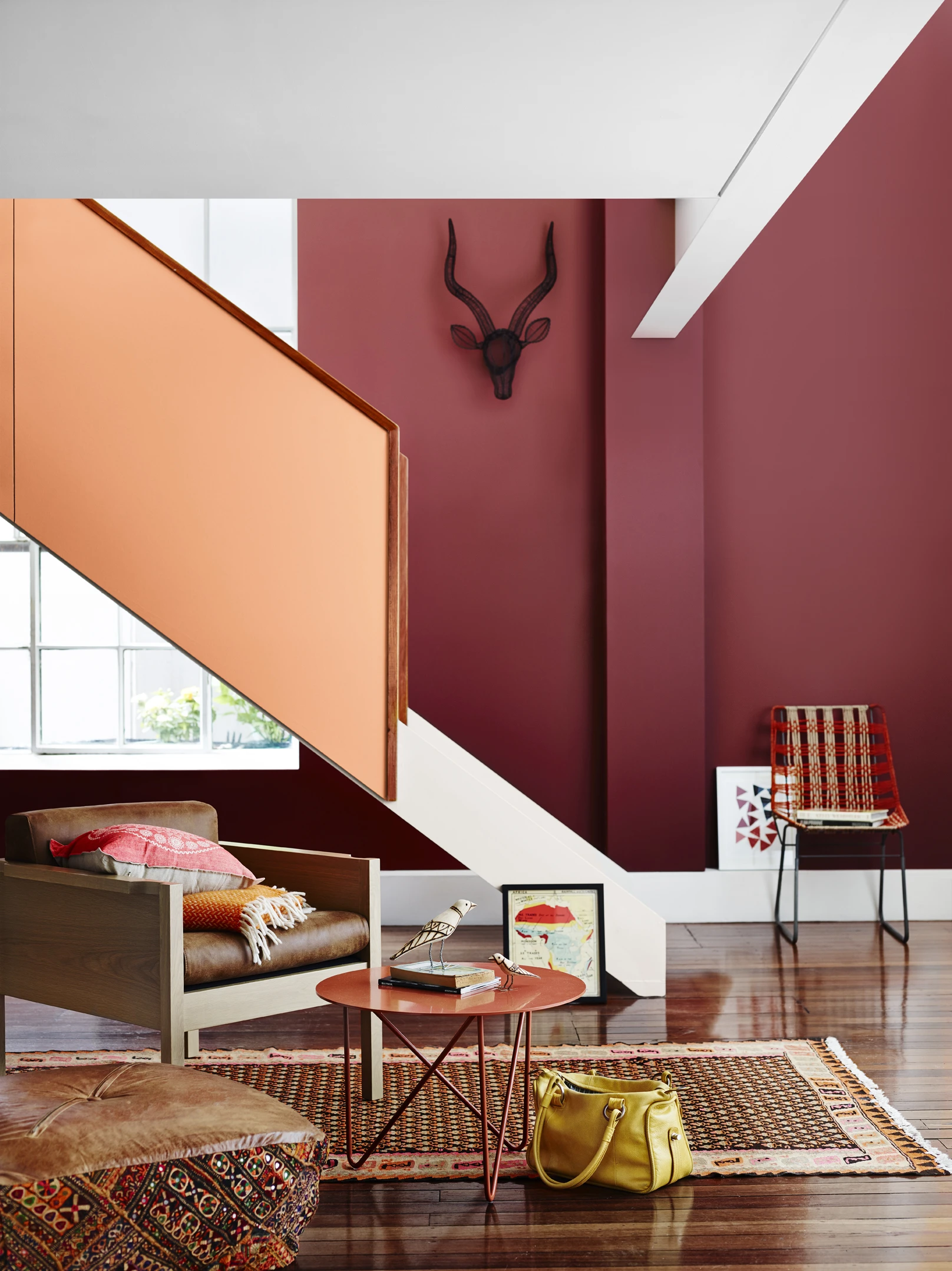
Colours that are not in the same colour ‘family’ or that aren’t exactly harmonious can work very well together. By using a bold or deep colour from one area of the colour spectrum and using a lighter colour from a different family, the overall impact can be quite striking.
Designer Tip
This blue and tan contrasting scheme uses subtle reduced hues, with blue being dominant and orange as an accent. The orange appears in the timber and leather elements as well as accents in the cushion.
Explore over 1,000 colours from the popular Dulux Colours of New Zealand range.
Available 7 days a week, start a chat with our team to discuss everything you need to gain colour confidence.
Enter your postcode or suburb to easily find your local trade centre. Click through to find store opening hours, contact details, and directions.
