How to use colour in your home
Whether you’re exploring a traditional, timeless look in whites and neutrals, or a contemporary style in playful hues; the colour scheme you select plays a significant part in the way your home feels. Discover ways to create mood with colour, explore popular interior colours, and get inspiration from real homes to help you choose the right colours for your space with our guide. Credit: @weavehomeau.
How To Guides
Create a mood with colour
Understanding how different colours work together can help you set the mood for your entire home. When it comes to looking at the vast range of paint colour selections available to you, it can be difficult to narrow down your options. Thinking about how you want your space to feel is a great place to start.
Tone
One way to look at colour is to consider its tone. Tone refers to lightness or darkness of a colour. Lighter tones create a fresh and soothing feeling, while darker colour palettes provide a more dramatic effect and are usually suited to bedrooms or studios to achieve a certain ambiance.

Temperature
Colours can also be divided into warm and cool. Warm colours, like red, yellow, and orange draw your attention to create a strong focal point. Cooler colours like blues and greens are softer on the eye, and tend to recede into the background, giving a sense of more space. Learn more about creating a colour scheme for your home.

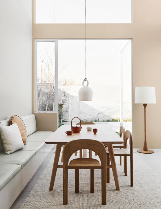
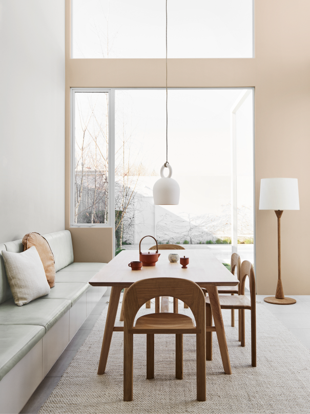
White & Neutrals
Fresh, natural, and timeless; whites and neutrals are classic, versatile colour choices that form the basis for many interior styles. These shades are often used in shared spaces of a home such as kitchens and living rooms as they are timeless and a simple backdrop to our daily lives. With so many shades to choose from, it can be tricky to find the perfect white for your home. Rooms flooded with plenty of natural light suit cooler tones, while warmer whites and neutrals can help to brighten up a darker space. Always trial colours in your own home using a Dulux sample pot to confirm your colour choice.

Wall
Lyttelton Quarter
Lyttelton Quarter is a soft grey white with a very subtle green undertone. It is ideal as a main wall colour both inside and out. Pair it with soft whites such as Te Āpiti and Mt Aspiring Half as well as deeper greys, greens and neutrals such as Lyttelton Double, Ōhai Half and Pūkaki.
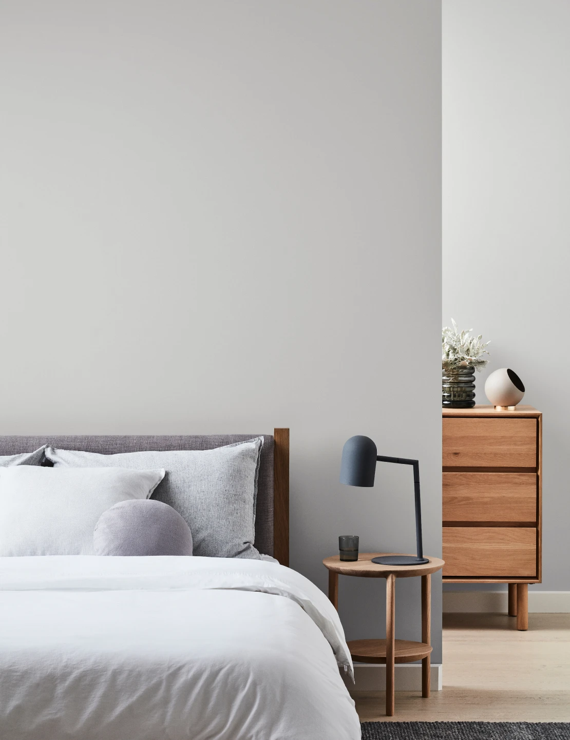
Greys
From welcoming warm tones through to cooler swatches, a grey colour palette creates a flexible backdrop that suits both natural materials and man-made additions. A popular colour choice for both interior and exterior surfaces, greys can help to open up a space, or create a soft, cocooning environment.Use deeper tones in spaces such as bedrooms or bathrooms where you're looking to add depth. Lighter tones are great for living spaces to bring together other colour accents.

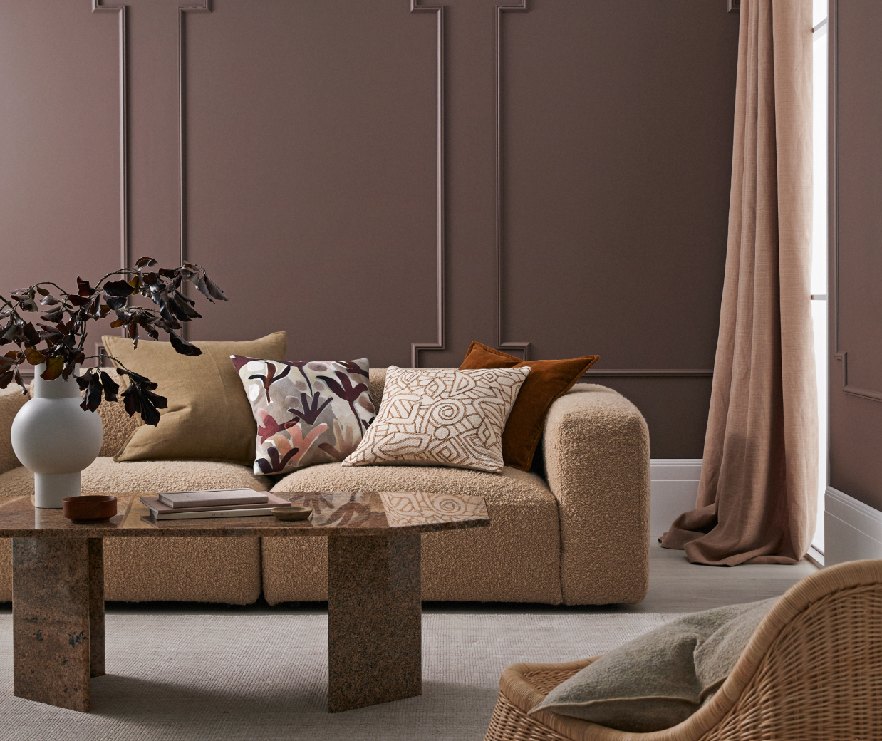
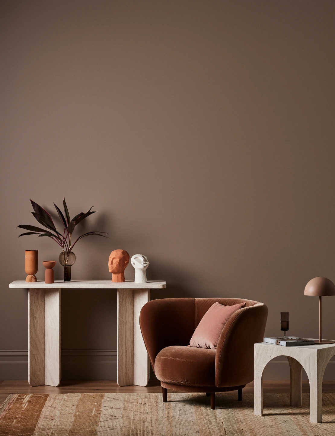
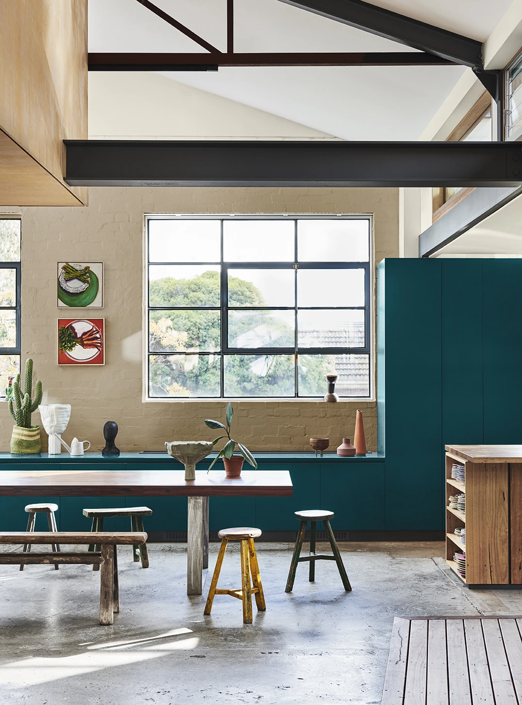
Browns
Create a peaceful, serene sanctuary in shades of brown. From rich chocolatey tones, through to tan, toffee and taupe — browns evoke a sense of decadence that suit both classic and contemporary styles. The natural, earthy hues add a grounding element to your home, ripe for relaxation. Browns work well in communal areas of the home such as kitchens and dining spaces as they are neutral enough to pair well with timber and metallic elements, yet still give your space an edge.

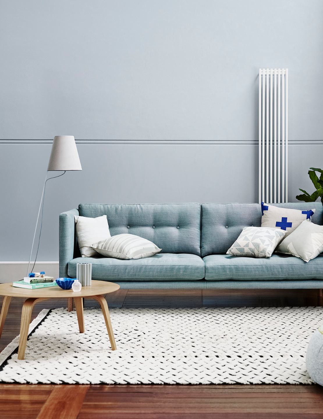
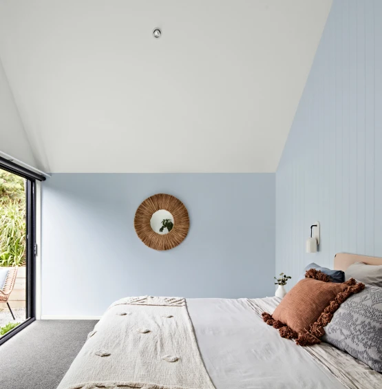
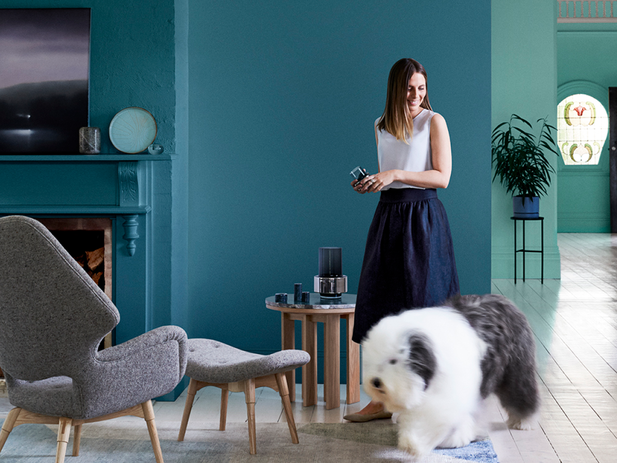
Blues
Blue hues are perfect for a tranquil and calming zone. Available in a rich spectrum from moody sophistication through to light, airy blue-grey tones, blue is a versatile and easily-complemented colour choice for interior and exterior spaces alike. They work magically in master bedrooms and as feature walls in larger spaces without clashing with textured interiors.
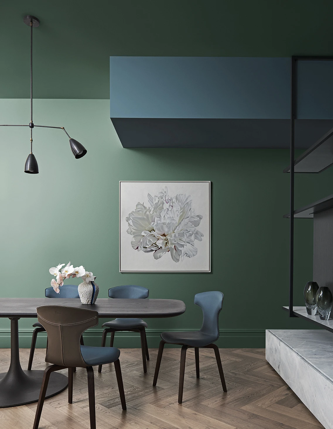
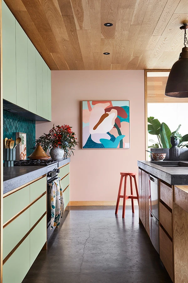
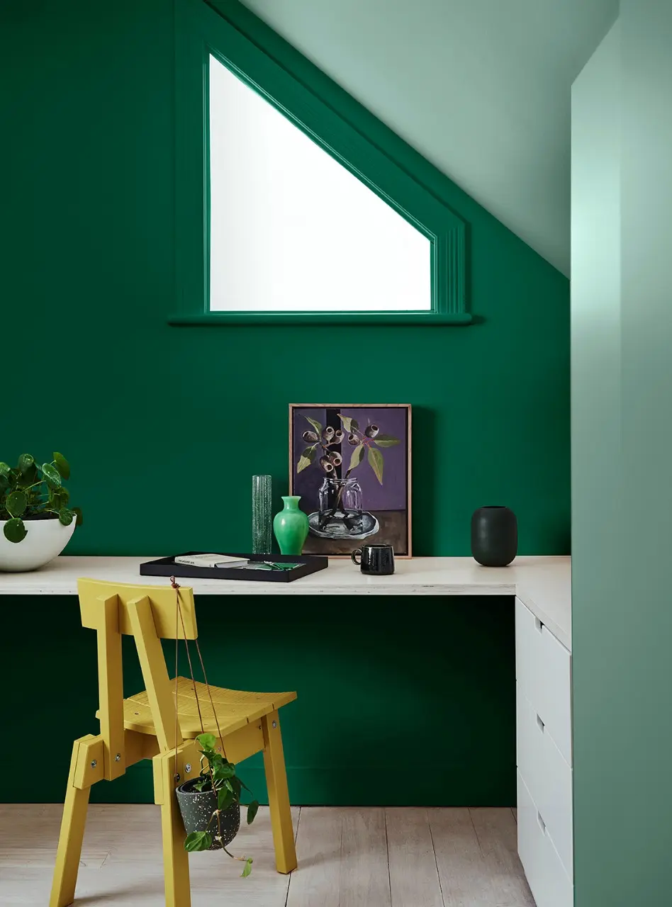
Greens
Bring a sense of the outdoors in by introducing green hues into your home. A calming addition that creates a fresh ambience, green tones make a dramatic statement that breathes life into any room. Greens tend to work very well in utility spaces such as bathrooms and laundry spaces as they can brighten up smaller spaces and make them feel more inviting.

Door
Southern Alps
The popular soft ultra-pure white of Southern Alps is the ultimate choice for interiors and exteriors. It is ideal for walls, ceilings, trims and features such as fretwork and window frames. The freshness of Southern Alps will brighten any space and give it a luxe modern vibe.
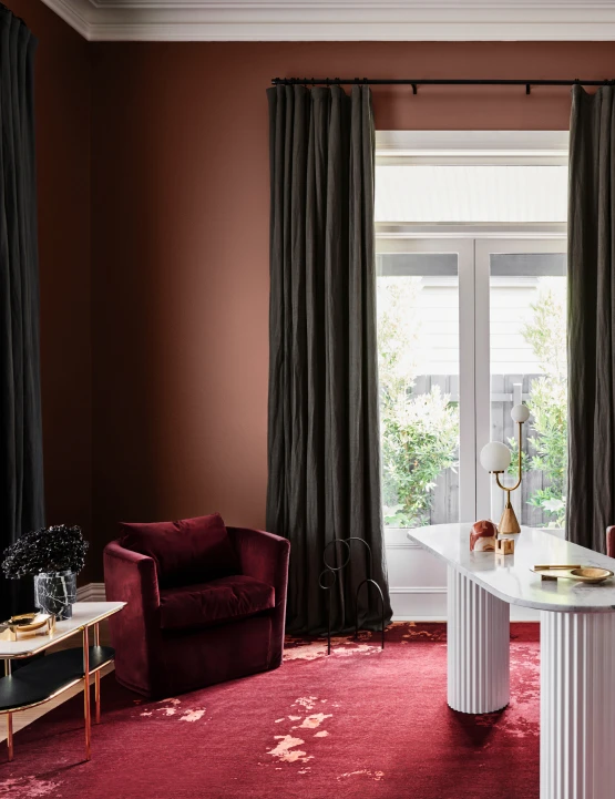
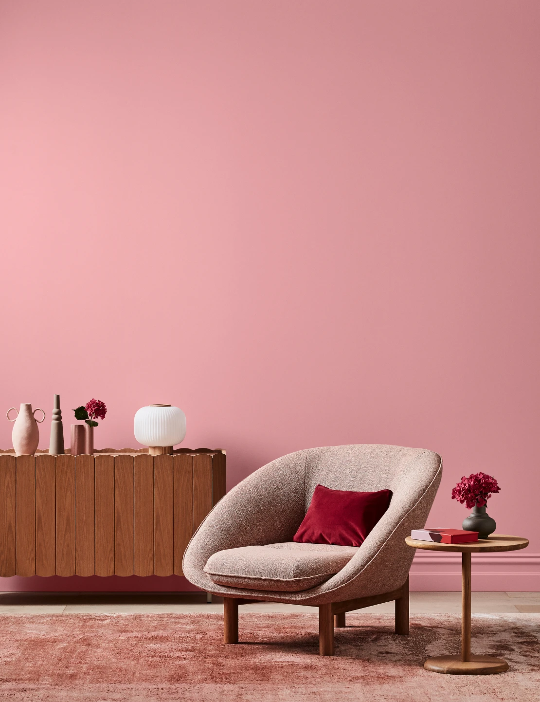
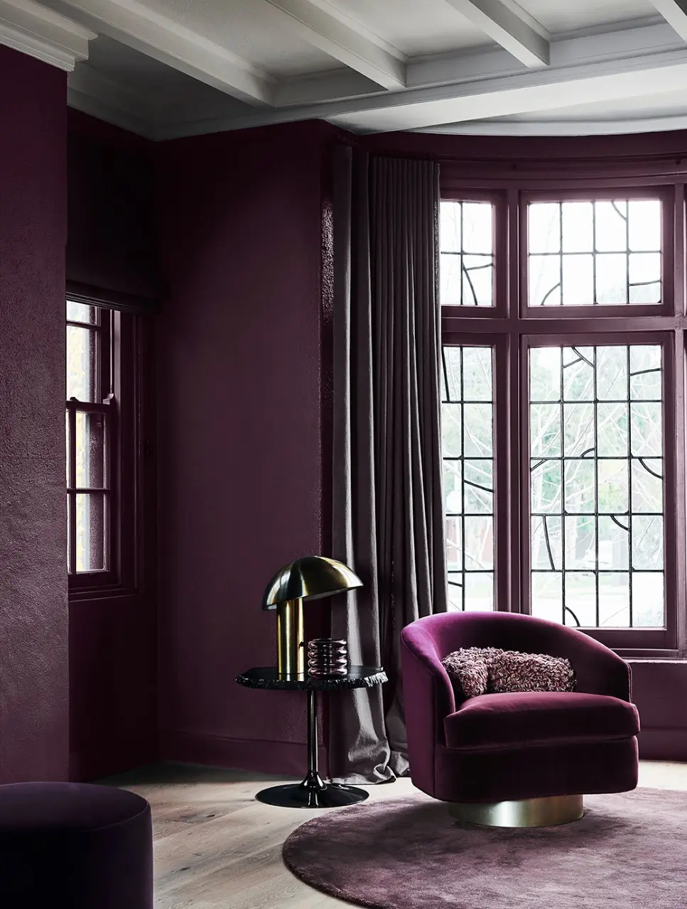
Pinks & Purples
Elegant jewel tones like pink and purple introduce a feeling of luxury. Create a timeless style with a contemporary edge in warm, rich hues; or instill soft relaxation to bedrooms and playrooms in muted tones. A deep purple can also bring a touch of sophistication to special zones in your home like a dining space for special occasions.

Once you’ve chosen your colour — don’t risk the result. The only way to bring your favourite hues to life at home is to mix Dulux colours with Dulux paint products. With Dulux Wash&Wear®, you’ll get exact colour accuracy as well as a finish that will look freshly painted for longer.
Get the look

Chimney breast
Concrete Effect Pale Elements
Dulux Design Concrete Effect
Enjoy the refined modern industrial textural effect of polished concrete. Make a statement in your home on interior walls in the living room, bedroom, or study.
Cabinetry
Big Lagoon
The fresh vibrant teal green of Big Lagoon is the perfect colour for accents and front doors. It pairs well with warm neutrals such as Ōpononi, crisp white Ōkārito as well as soft, yellows, blues and greys.
Wall
Deep Exquisite
Deep Exquisite is a deep moody purple with a pink undertone that makes for a striking interior colour on feature walls in living areas and bedrooms.
Wall
St Clair Quarter
St Clair Quarter is a crisp, clean, cool white suitable for trims or main walls both inside and out. It works well with a wide range of colours including neutrals, cool greys and charcoals such as Mt Hikurangi, Grey Lynn and Manorburn.
Wall
Rousseau Green
Greens range from yellow citrus greens through to blue-greens such as teals. Lighter muted greens can add a peaceful and relaxed feel to a room whilst citrus and brighter lime greens can liven up a space. Greens are versatile and easy to live with and can be used on the inside and outside of your home.
Wall
Lyttelton Quarter
Lyttelton Quarter is a soft grey white with a very subtle green undertone. It is ideal as a main wall colour both inside and out. Pair it with soft whites such as Te Āpiti and Mt Aspiring Half as well as deeper greys, greens and neutrals such as Lyttelton Double, Ōhai Half and Pūkaki.

Wall
Pōhutu Geyser
Pōhutu Geyser is an earthy brownish-red that works well for accents and front doors. Pair it with a warm white such as Epsom or a very soft pinkish neutral such as Garston Double. Pōhutu Geyser can make a great addition to a traditional or heritage colour scheme.
In-home Colour Consultation
Colour Design Service
Save time and gain colour confidence the smart way with personal guidance from an expert Dulux Colour Consultant. Enjoy a home refresh sooner with our In-home and Online Colour Consultations.


