Milan Design Week 2023
Colour Trendspotting
The Dulux colour team is in Italy as part of their year-round research into the latest global and local trends that are predicted to influence New Zealand design and how we live.
Oh, how we’ve missed you Milano!
Milan Design Week Furniture Fair is the launchpad of design and innovation in the world, showcasing the latest in colour and design trends that will influence the built environment in the continued design cycle.
Day Six
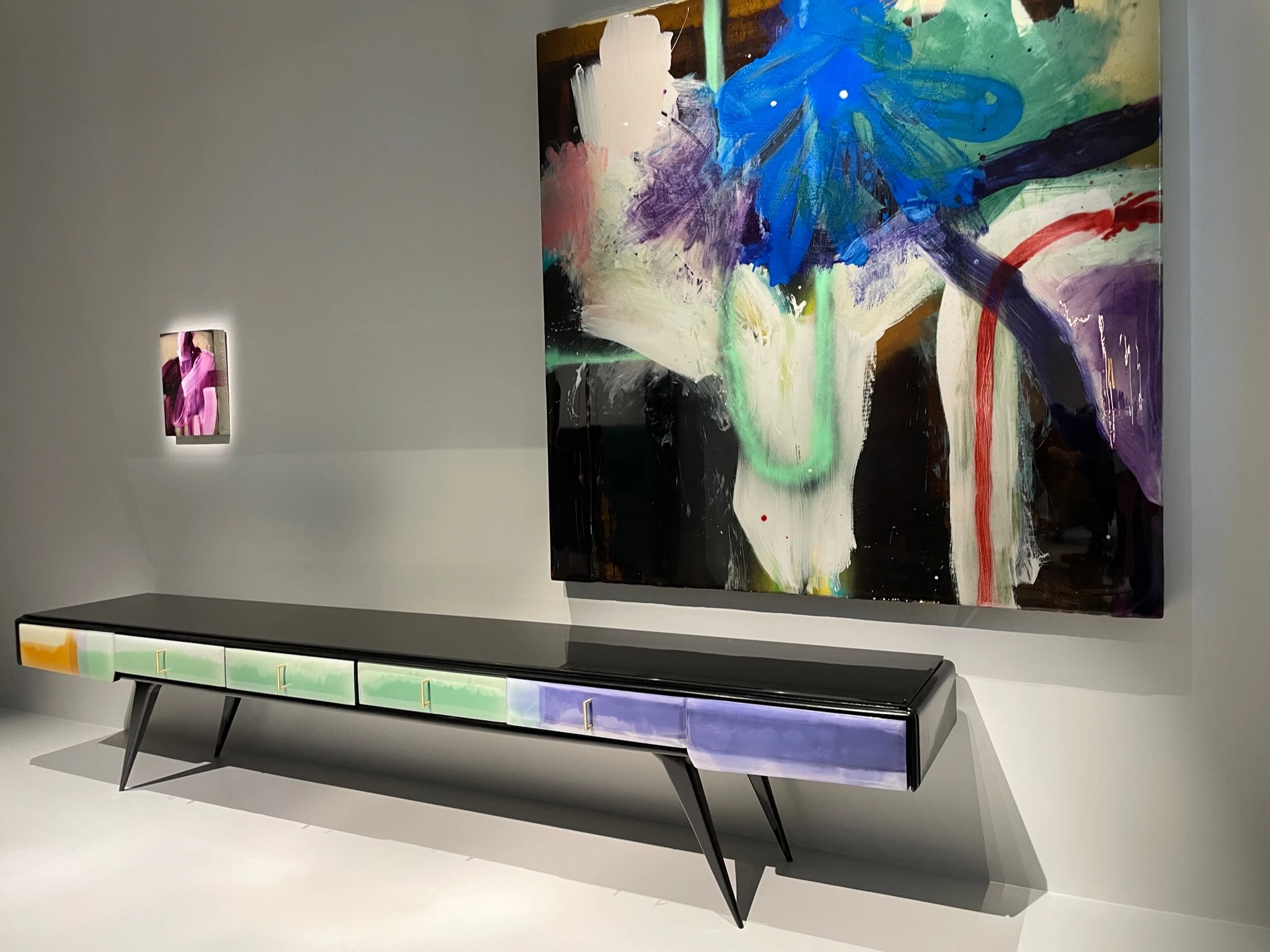
Louis Vuitton, La Manufacture, Elle Décor, Moooi, Campo Base, Acerbis, Archiproducts
Today was the final day for the Dulux Colour Team to be immersed in all things colour and design in Milan! Here are a few of our highlights.
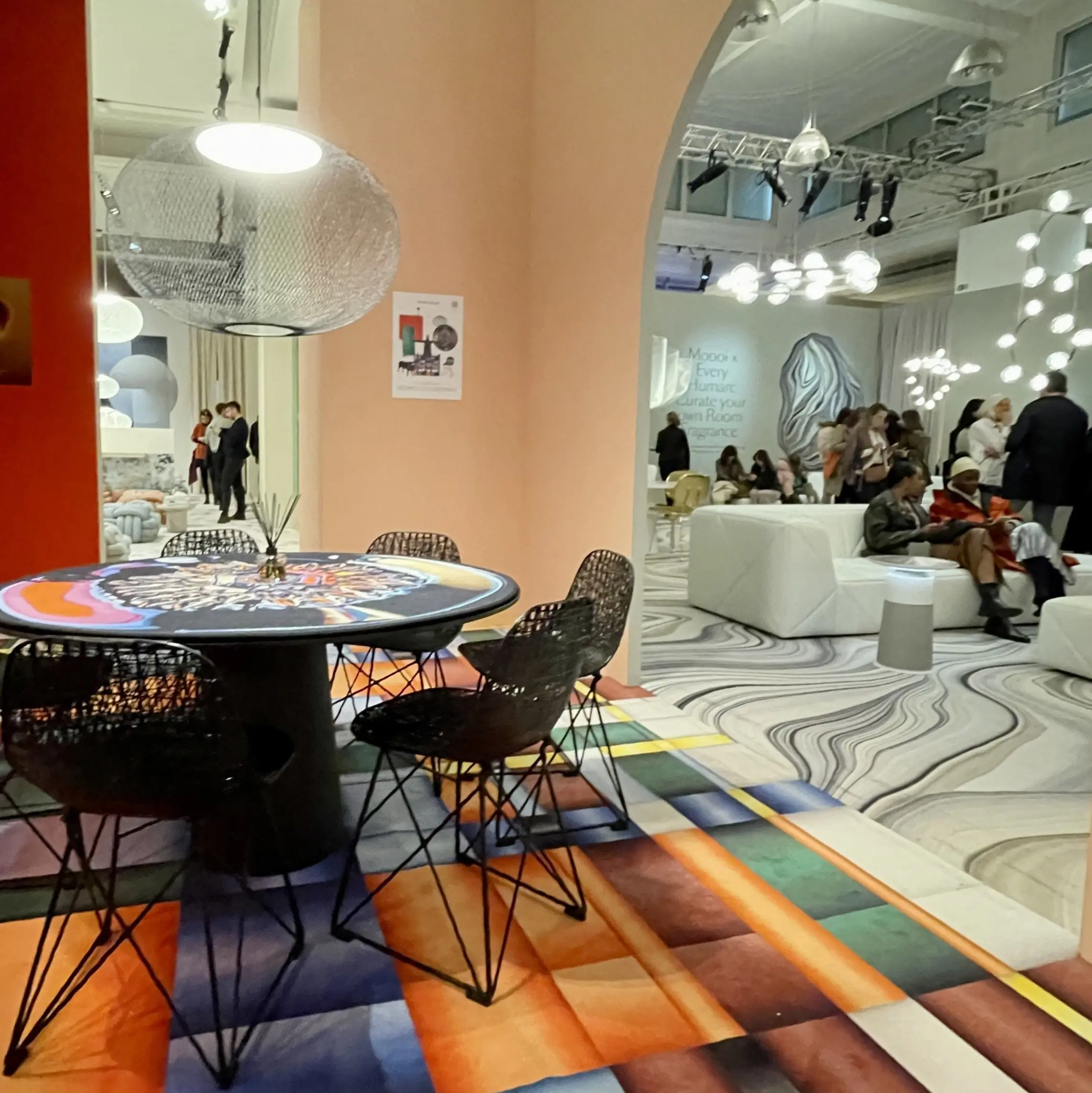
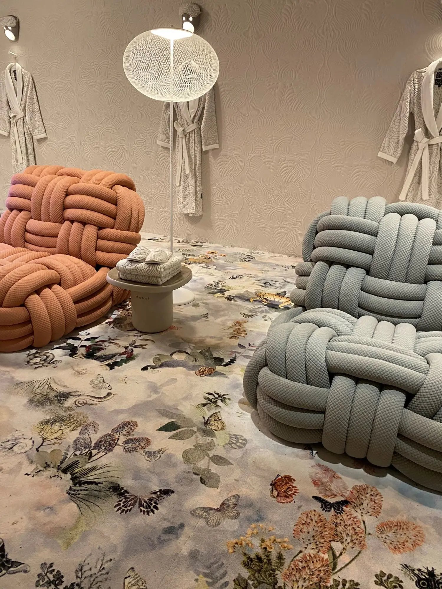
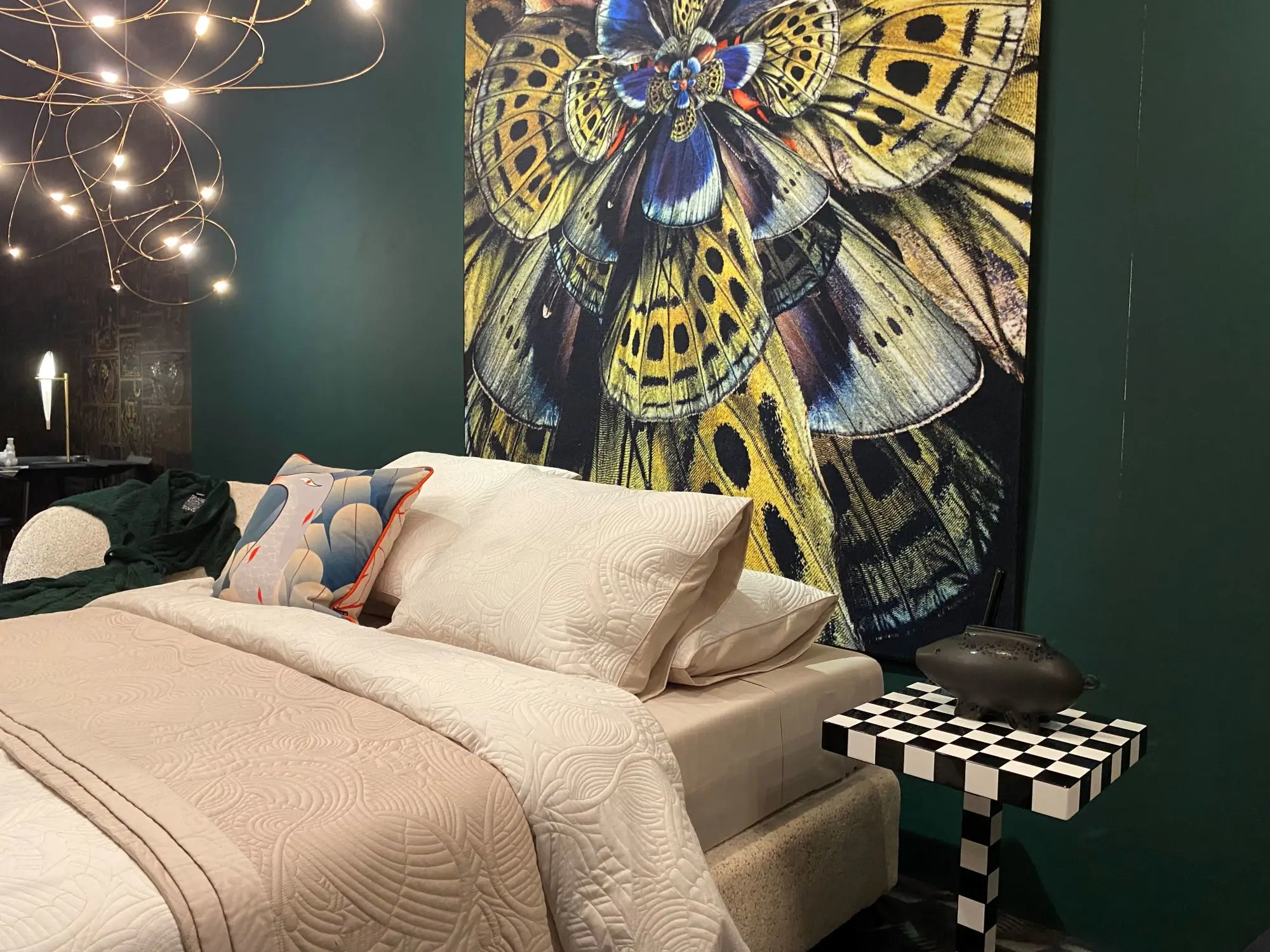
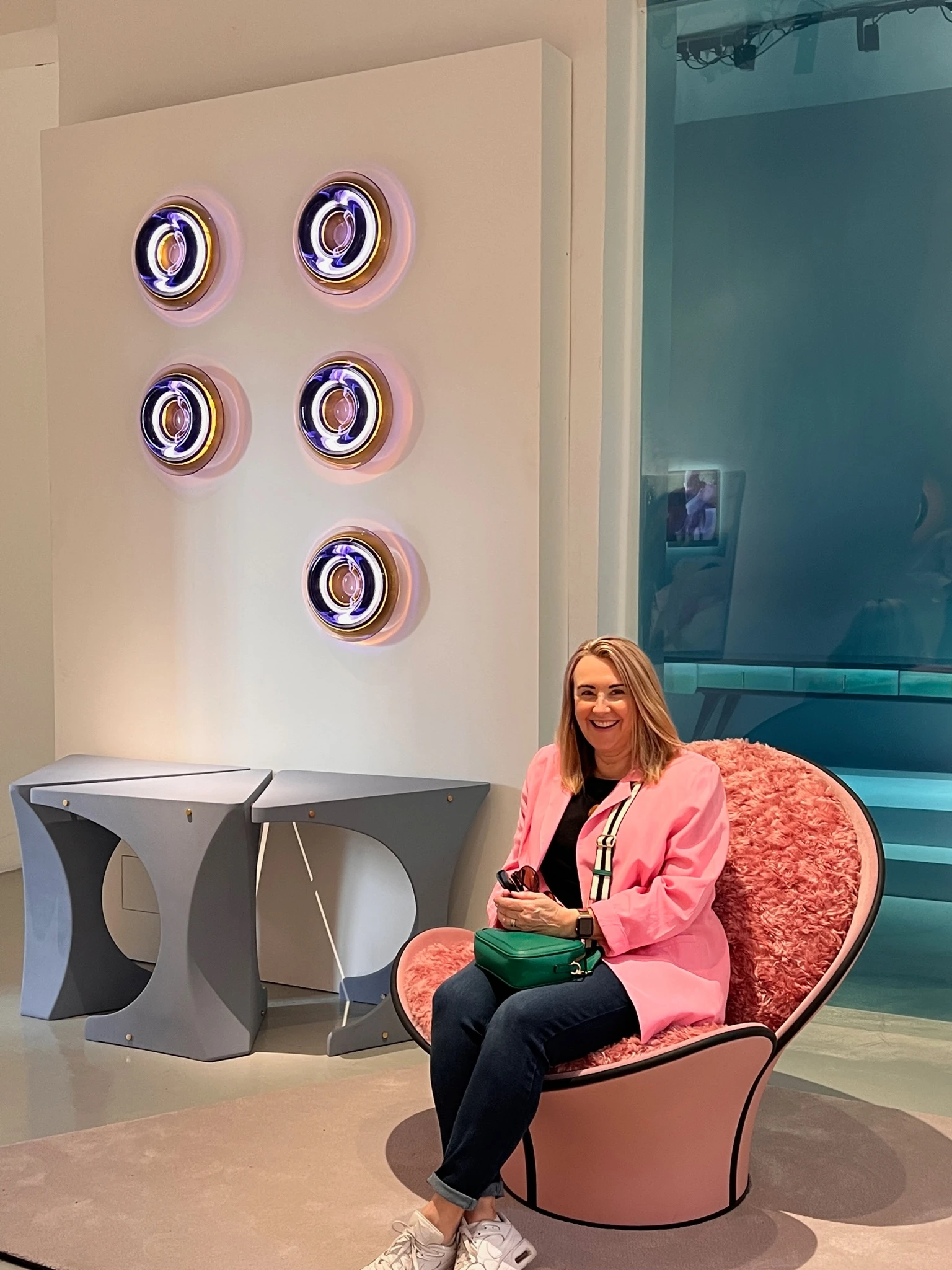
La Manufacture
La Manufacture featured its new collections in seven curated rooms in the stunning Casa Manzoni with each space united by a reference to nature and its elements.
Moooi
Dutch furniture, interior, and lighting design company Moooi provided a fully immersive experience with its installation – A Life Extraordinary. Here we explored the intersection of technology and humanity through innovative design. We experienced a bespoke room fragrance fuelled by artificial intelligence in each space.
Get the look with Dulux Elm Branch hereGet the look with Dulux Fuzzy Peach hereGet the look with Dulux Glinks Gully Double hereGet the look with Dulux Government Green here
Get the look with Dulux Urewera Half here
Urewera Half is a soft earthy tan with a slight greenish undertone that is perfect for interiors and exteriors. It is ideal for use with warm, soft whites such as Cardrona Half.
Get the look with Dulux Fuzzy Peach here
Orange can radiate warmth and energy and is quite stimulating and thought provoking. Orange is available in many shades and tones. Burnt orange looks great in formal areas and the lighter orange shades of apricot or peach work beautifully in bedrooms and living spaces.
Get the look with Dulux Glinks Gully Double here
Glinks Gully Double is a popular soft and warm sandy neutral. It is great when used as main wall colour both inside and out. Team this classic neutral with warm whites such as Cardrona Half and Southern Alps, as well as deeper browns such as Norsewood, Terrible Billy and Colorsteel® Ironsand.
Elle Décor
Elle Décor’s installation ‘The Art of Light’ focused on the role of light in domestic spaces; how it illuminates our homes, emphasises the shapes of objects and furnishings, changes the way we see colour, and affects our mood.
Get the look with Dulux Tauherenīkau here
The lovely soft mid-based green of Tauherenīkau works well with cool whites such as Ōkārito, soft greys such as Manorburn and dark charcoals such as Titirangi. A popular colour choice for living spaces, bedrooms and bathrooms.
Day Five
Salone Del Mobile (Milan Design Fair)
Today the Dulux Colour Team embarked upon Salone Del Mobile – the largest trade fair of its kind in the world. The exhibition showcases the latest in furniture and design from countries around the world. This year was the return of Euroluce, the event dedicated to lighting design, which was back after a four-year hiatus.
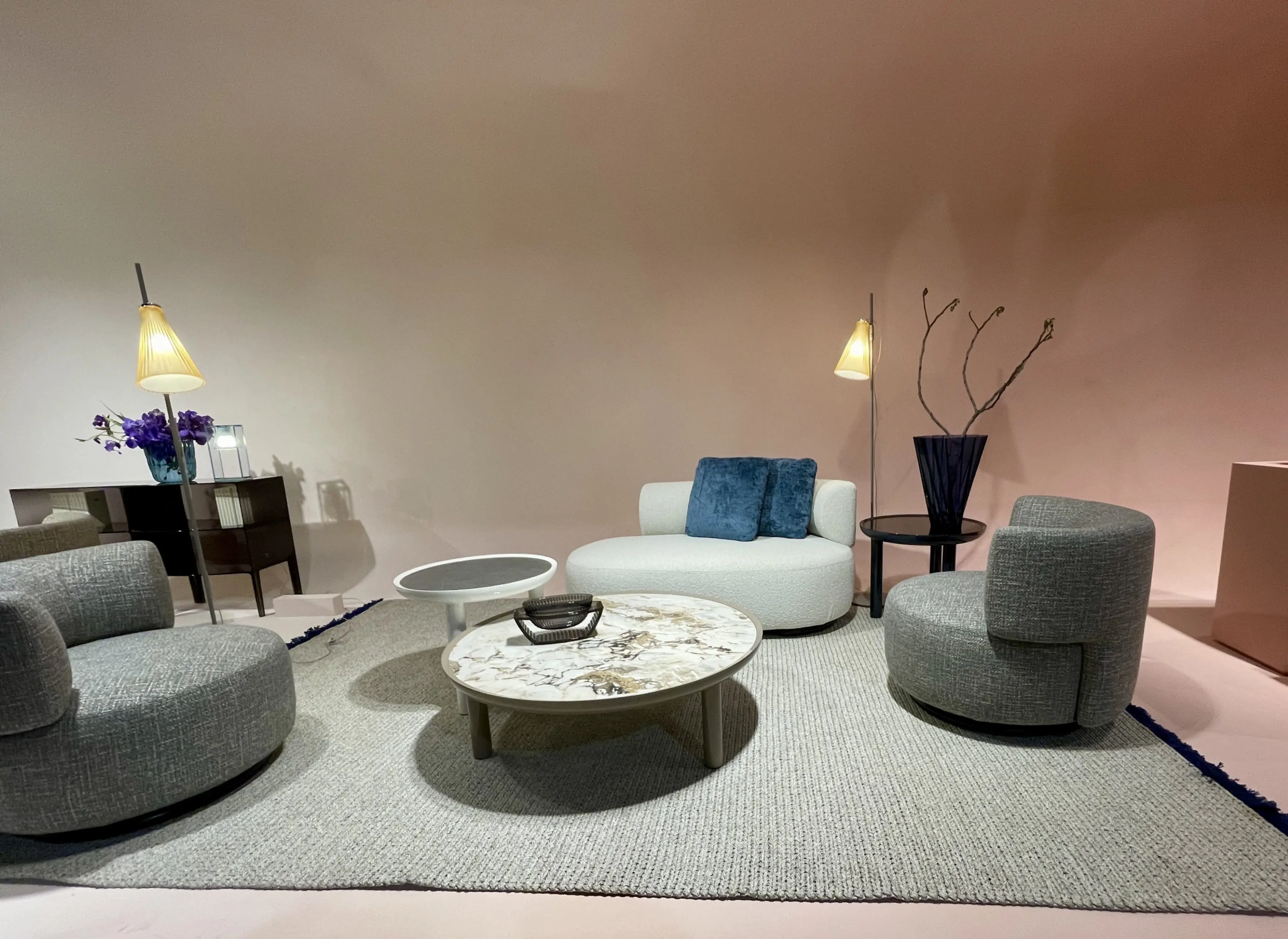
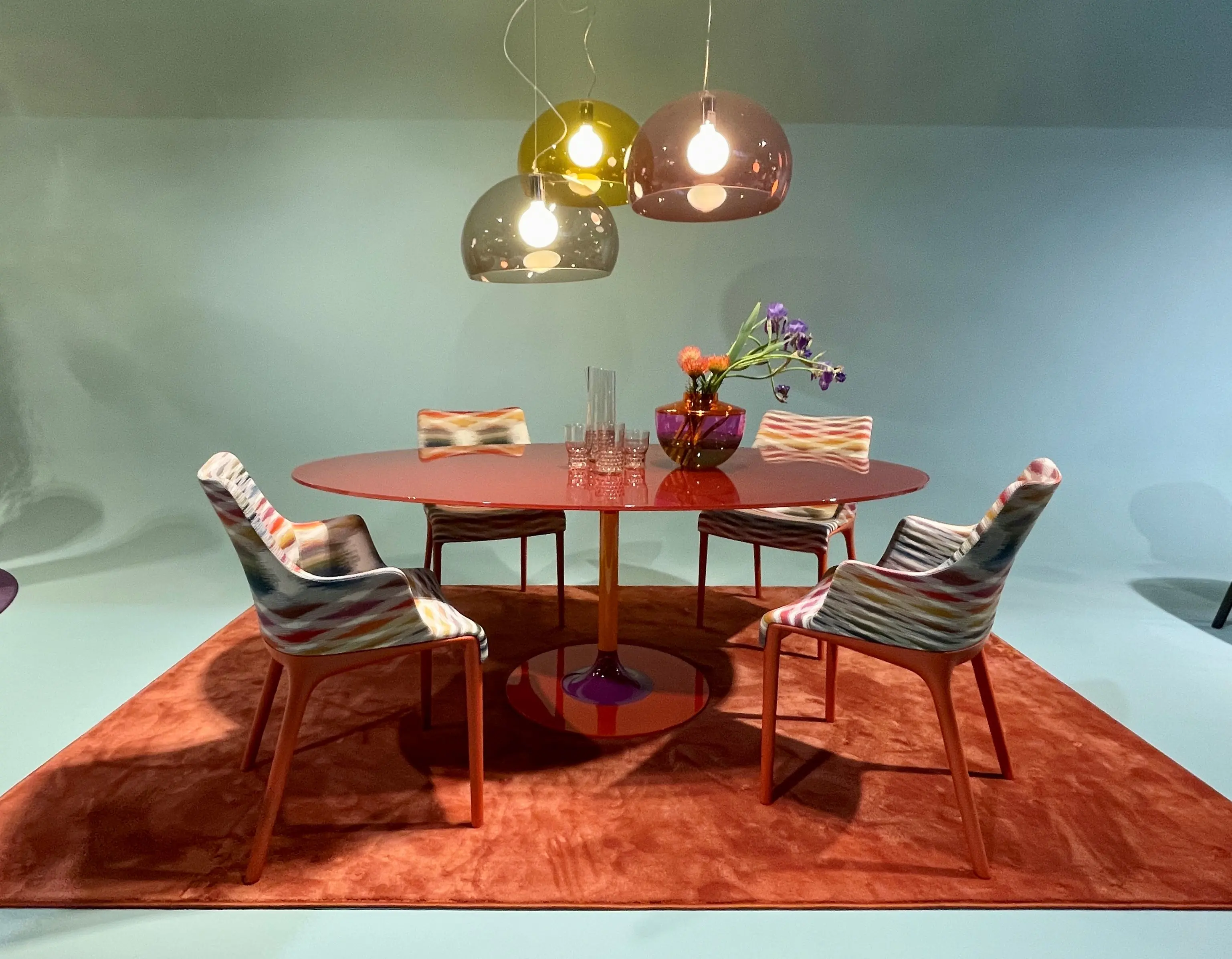
Salone Del Mobile features global furniture, design and lighting brands such as Molteni&C, Kartell, Baxter, Flexform, Miniforms, Arper, Sancal, Edra, Arflex, Glas Italia, Magis, Gessi, to name a few!
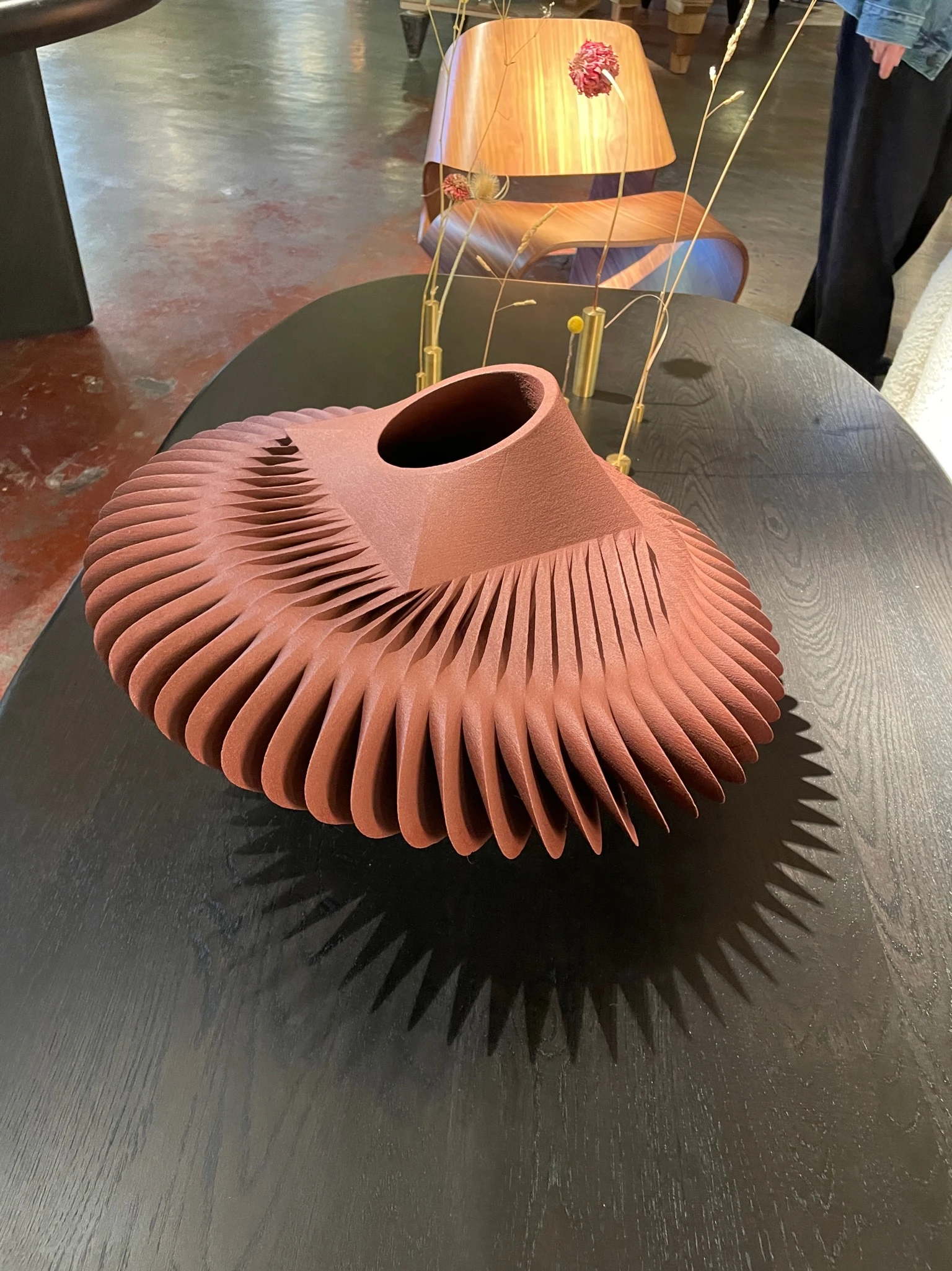
Kartell installation
One of our favourites was the colourful Kartell installation – a beautiful engaging experience where the coloured walls were woven from yellow greens right through to warm pink-browns.
Get the look with Dulux Halfway Bluff here
The coral tones of Halfway Bluff will bring a warm and positive vibe to any room. It is perfect for accent walls and formal rooms as well as striking highlights outside. Try pairing it with warm neutrals such as Optio Bay and Hicks Bay.
Get the look with Dulux Hinuera here
Yellows are vibrant and reflective and can create a happy and bright environment. Yellow is warm and is perfectly suited for south-facing spaces. Yellows can be used in casual living areas, hallways and entry spaces to create a light-filled bright setting.
Get the look with Dulux Rangiora here
Rangiora is a soft dusty pink that can be used as a main wall colour or as an accent colour such as on a front door. Pair it with crisp whites, neutrals, greys or try it with a deep burgundy such as Gibbston Valley.
Molteni&C goes neutral
In contrast to Kartell’s colourful stand, Molteni&C leading Italian designer furniture company, featured an array of elegant neutrals.
Get the look with Dulux Howick Half here
Howick Half is a soft neutral with a red undertone. This versatile colour can be used in both traditional and contemporary homes and brings a lovely warmth to the space. It pairs well with the lush warm ivory of Remuera.
Day Four
Nilufar Gallery, Paola Lenti, Fferrone, Isola Design Gallery, Clay Court Club by Cristina Celestino, Spazia, Hermès, Marset, Dimore Gallery, Muuto, Missoni
Another huge day on the ground for the Dulux Colour Team at Milan Design Week. Day 4 was a mix of visits to design heavyweights such as Hermès, Missoni and Dimore, and creative newcomers like those featured at the Isola Design Gallery.
We loved the work of Nina Yashar, founder of Nilufar Gallery, who presented The Bright Side of Design a seamlessly blended dialogue between research on old masters and the discovery of contemporary creators.
Scandinavian design company, Muuto joined forces with H+O and Vzug to create a distinctive installation exploring the concept of the Butterfly Effect. Sharing a passion for colour, form and tactility – they investigate how this impacts our perception of a space.
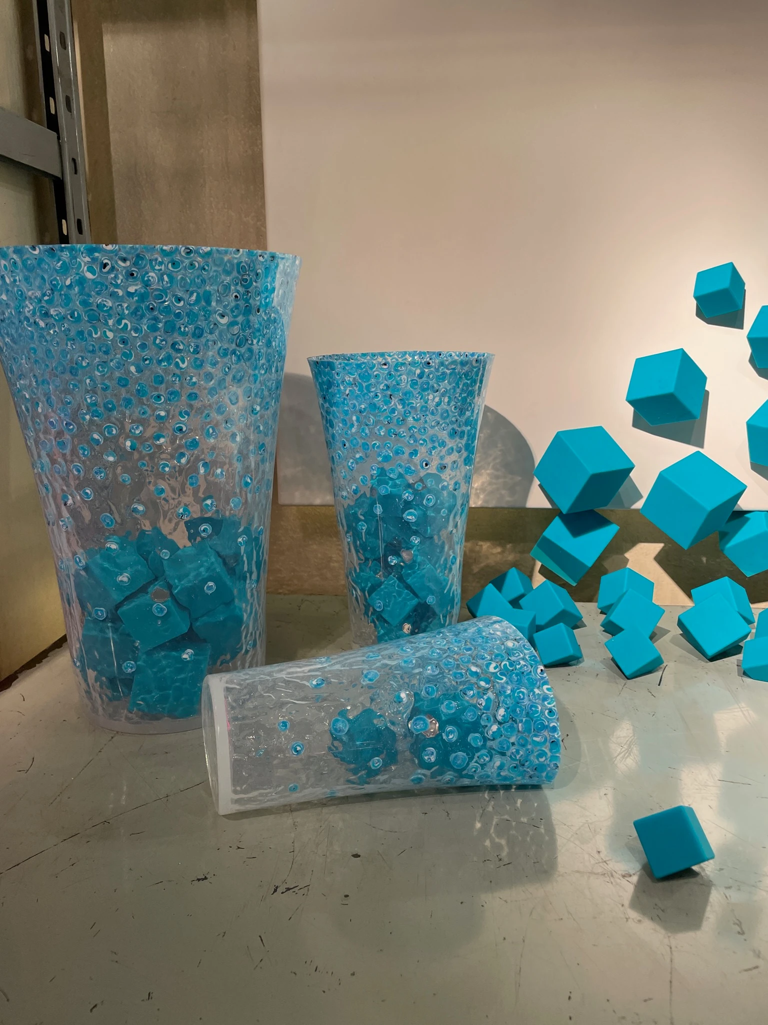
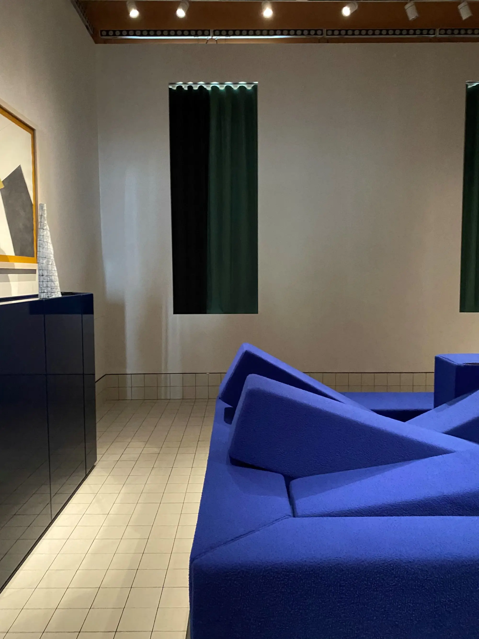
Bright Side of Design at Nilufar Gallery
Nilufar Gallery took us on a journey that put the spotlight on all that design has to offer and continues to create. We fell in love with the restful and elegant spaces featuring beautiful colour combinations and exquisite design and art pieces.
Get the look with Dulux Tītī Islands here
The muted greyed-off light pink of Tītī Islands is great for nurseries, bedrooms and features outside. It pairs beautifully with warm whites.
Get the look with Dulux Heaphy Track here
Heaphy Track is a lovely sage green with a hint of grey. It works well as an exterior house colour or as a bedroom, bathroom or kitchen colour inside. Pair it with soft whites and neutrals such as Haast and deeper greens such as Mt Messenger.
Sharing a passion for colour, form and tactility
The Muuto, H+O and Vzug exhibition was described as “a physical manifestation of the profound effect seemingly small changes in our immediate environment can have on everyday life and our sense of wellbeing”.
Get the look with Dulux Te Puna here
Yellows are vibrant and reflective and can create a happy and bright environment. Yellow is warm and is perfectly suited for south-facing spaces. Yellows can be used in casual living areas, hallways and entry spaces to create a light-filled bright setting.
Day Three
Gubi, Alcova, Gallery Philia, Shaped By Water by Google, Loewe, Cappellini, Cassina, Marimekko
Day three of the Milan Design Fair was an incredibly immersive experience of colour, pattern and texture.
Gubi
The public bathing pool set the scene for the Gubi installation Beyond the Beetle in which visitors wove their way around an array of stunning spaces featuring neutral and natural colourways with layered textures intermingled with stripes.
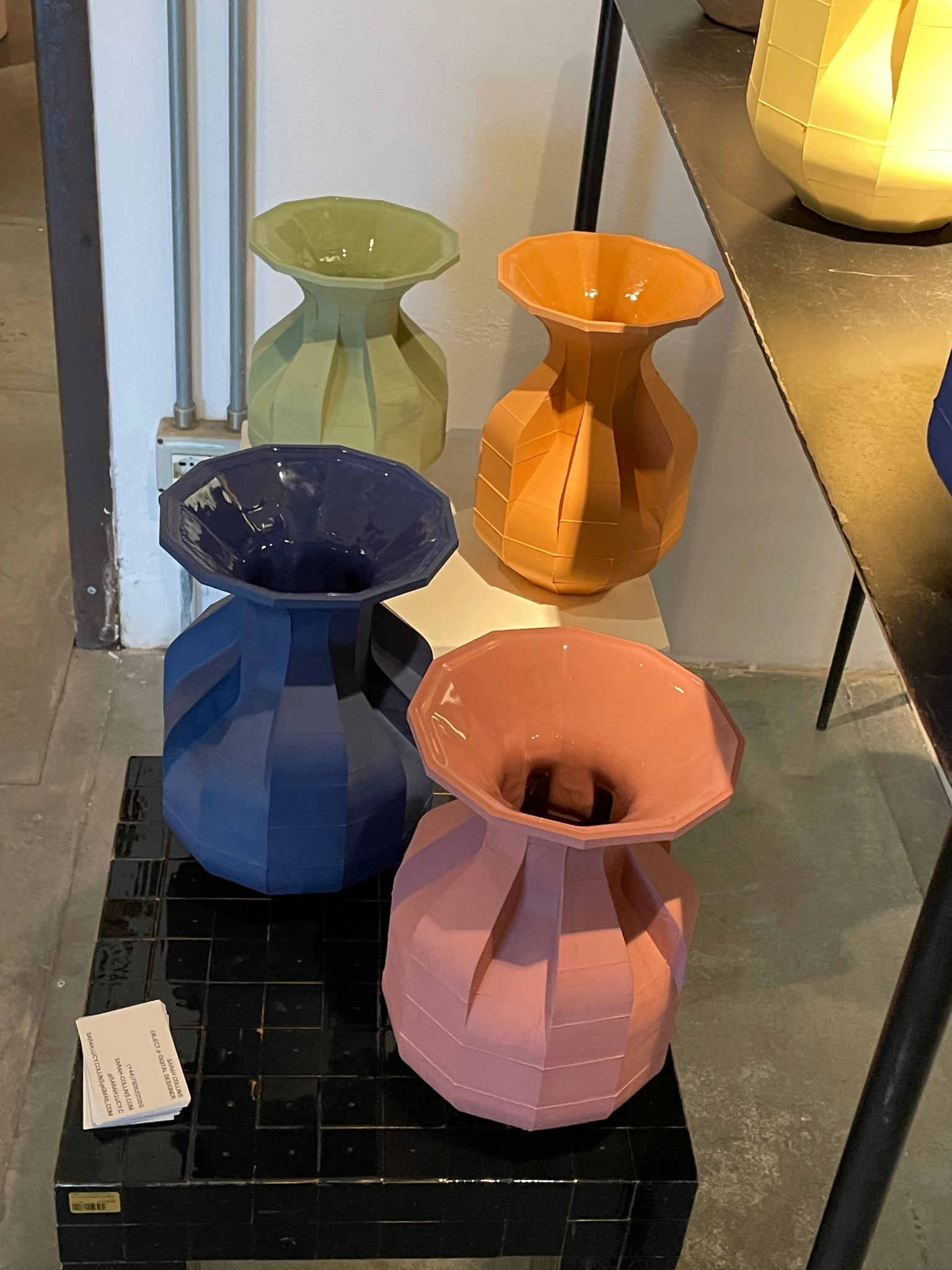
Get the look of Dulux Cardrona here
Cardrona is a soft and natural looking warm white that is loved by home renovators and interior designers alike. This versatile white will brighten any space and is perfect for exterior features.
A colour-lovers dream!
The Cassina showroom, Durini, was a feast of colour and interesting and unexpected colour combinations. Hot pinks were paired with chocolate brown and soft aqua, soft mid-blues were teamed with red, and rust that highlighted rich deep blues.
Get the look with Dulux High Street here
High Street is a vibrant deep pink with depth and vitality perfect for interior and exterior accents. It pairs well with Southern Alps as well as soft beiges such as Tōrere Half.
Get the look with Dulux Mossburn here
The stunning grey-violet of Mossburn adds a light regal touch to your home. Try teaming it with crisp whites and greys.
Get the look with Dulux Mossburn here
The stunning grey-violet of Mossburn adds a light regal touch to your home. Try teaming it with crisp whites and greys.
Get the look with Paekākāriki here
The warm, slightly muted creamy yellow of Paekākāriki is a wonderful choice for main walls or a feature colour inside and out. It pairs well with warm whites such as Sandfly Point Quarter and Cardrona and mid-to-dark blues.
Day Two
cc-tapis, Cassina, COR, Ross Gardam, Artemest at 5 Vie
Colourful furniture and design inspiration were the hallmarks of day two for the Dulux Colour Team at the Milan Design Fair.
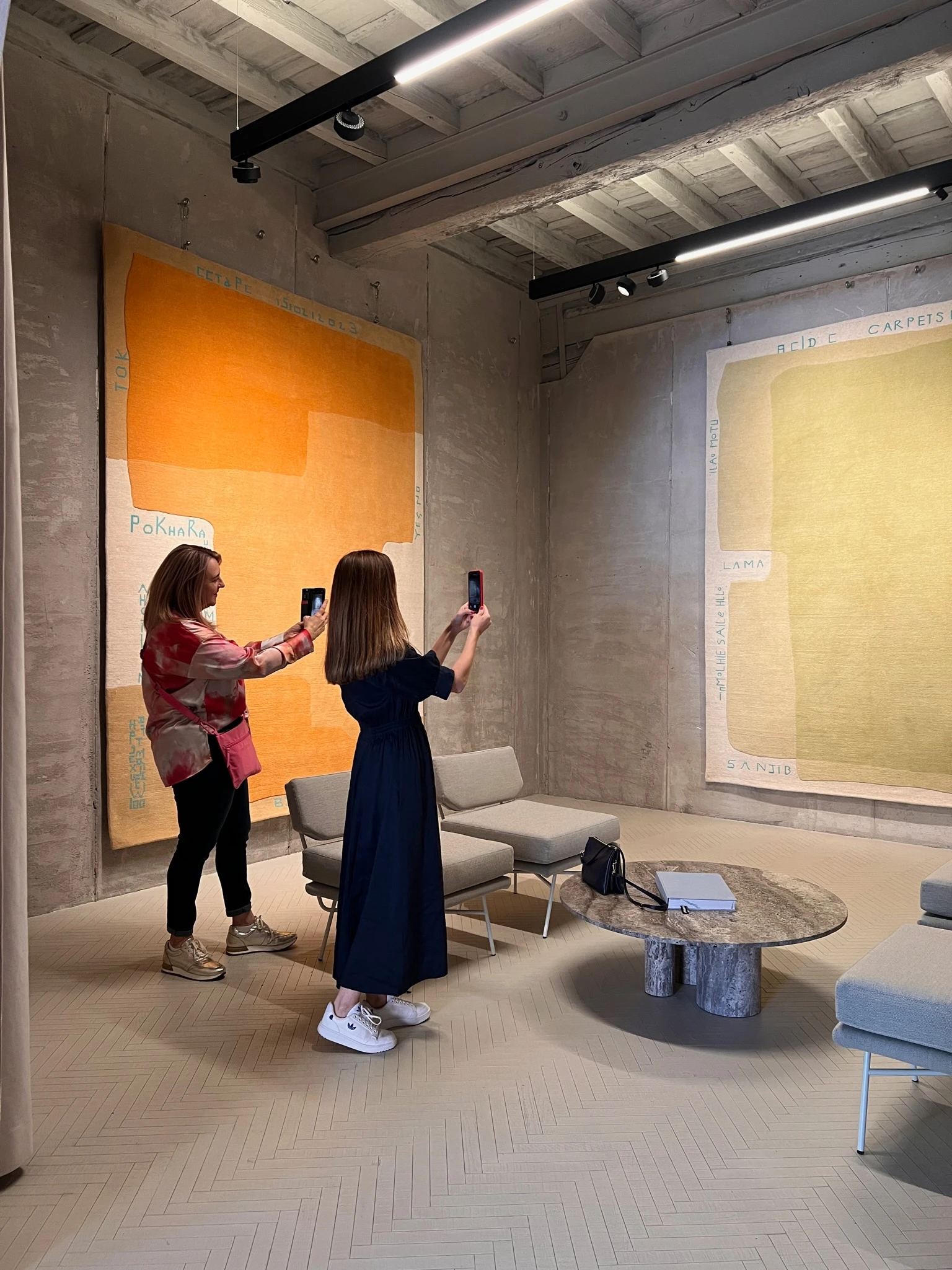
cc-tapis
The Dulux Colour Team started the day with a visit to cc-tapis, an Italian design company that produces contemporary handmade rugs for residential and contract spaces. The Guadalupe Collection by renowned designer Bethan Laura Wood, featured colourful rugs inspired by her archive of ‘public patterns’ collected during her extensive travels. Her designs inspired us with unique combinations of colours and patterns. We also loved seeing all the rich, warm colours including pinks, buttery golds and plums.
Cassina
No visit to Milan Design Week is complete without a visit to Cassina store, a pre-eminent design leader and manufacturer of original contemporary furniture. For its 50th anniversary of the Cassina iMaestri Collection, the company presented Echoes, 50 years of iMaestri, curated by art director Patricia Urquiola with Federica Sala in a modern and industrial setting inside a historical building in the Cordusio area of Milan.
Artemest
Artemest, the online destination for contemporary Italian craftsmanship and design, is a 1930s Milanese apartment curated by six prestigious international design firms. The unique location provided the perfect backdrop for interior designers to showcase their distinctive creative visions, with each studio designing its own room in the apartment. The dining space was captivating in a cream and soft yellow tan painted stripes by designer Nina Magon Studio.
Get the look of Dulux Cardrona here
Cardrona is a soft and natural looking warm white that is loved by home renovators and interior designers alike. This versatile white will brighten any space and is perfect for exterior features.
COR furniture
Germany furniture brand COR presented its latest furniture collection in a beautiful apartment in the Brera district. We were inspired by the immersive display of colour used in each space to create an emotive atmosphere.
Get the look with Dulux Mission Bay here
Blues can create a tranquil and calming atmosphere in your home. Dark blues can add a sophistication and moodiness to the space whilst lighter blues can add a sense of calm. Blue is a versatile colour and can be easily schemed with many other colours for the interior or exterior.
Get the look with Dulux Moa Flat here
Moa Flat is a lovely wheat-coloured brown with yellow undertones. This versatile colour can be used as a main interior or exterior wall colour or on accents or feature walls. Team it with warm whites such as Sandfly Point Half and Epsom as well as deeper browns such as Granity or Te Pūpūha Point.
Day One
Rosanna Orlandi Gallery; Magenta District, Bocci; Zona Vincenzo Monti
It's day one and we’ve hit the ground running at Milan Design Week, which started with a bang on April 17. Today the Dulux Colour Team was given the chance to preview the iconic Rosanna Orlandi Gallery and Bocci installation.
Rosanna Orlandi is a destination for new artists and designers. She has the power to recognise exceptional talent and curate their work as a collective experience.
Bocci recently restored an early 20th-century Milanese apartment in an intimate residential setting showcasing incredible lighting with shapes and designs representing oceanic natural forms. The rich walnut timber featured in the furniture from the Irish brand Orior complimented the materials in the handblown glass.
Bocci apartment
The Bocci apartment featured beautiful lighting displays in organic shapes and forms. A navy blue sofa by e15 was highlighted by a warm white backdrop.
Get the look with Dulux Waiau Bay Half here
Waiau Bay Half is a soft neutral that transforms any room in the house into a cosy and comfortable living space. Its natural undertones make it the perfect match for warm whites, warm neutrals, reds and browns. It pairs well with warm whites Southern Alps and Cardrona Half.
Colour Waterfall
This crisp, bright white is the perfect backdrop for the Colour Waterfall installation, which picks up on the immersive colour concept of the Lighting Boxes by artist and composer Brian Eno with new objects by Draga & Aurel.
Teal trend
A beautiful room in deep teal green was designed by Francesco Meda for C Design. This stunning colour, taken part way up the wall, helps to add an architectural element and define the space.
Milan Design Week under the spotlight
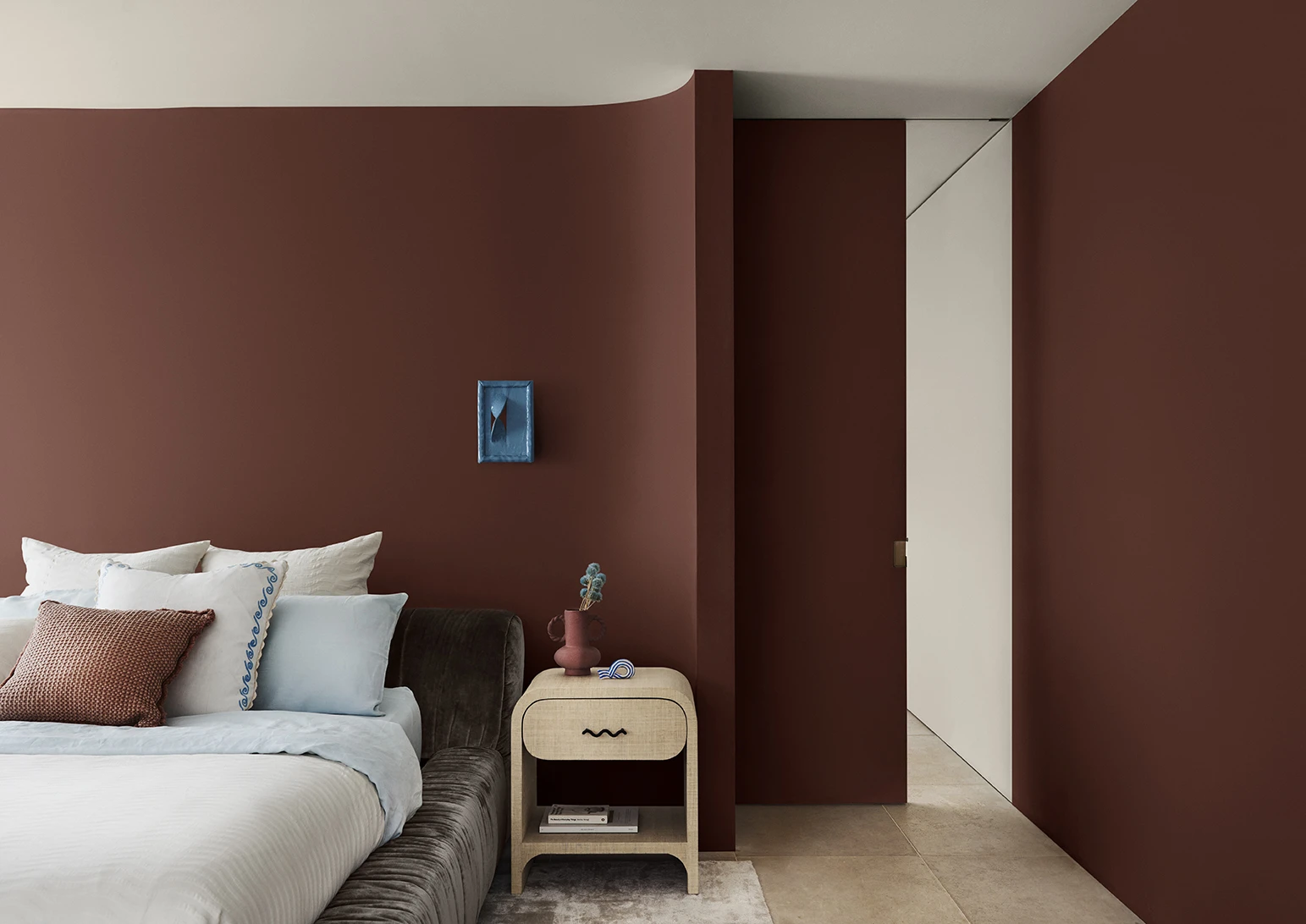
Dulux Colour Forecast: now and then
Dulux Colour Forecast 2024 reflects an inner desire for positivity and spaces that nurture within our homes with warm colours such as rich golds, olive greens and reddy browns.
We're proud to be at the forefront of colour trends in interior design as we celebrate the 15th anniversary of the Dulux Colour Forecast!
Download the Dulux Colour Forecast 2024 brochure to explore the three beautiful palettes and be inspired to transform your home with the latest trends.