Colour Forecast 2021
Nourish
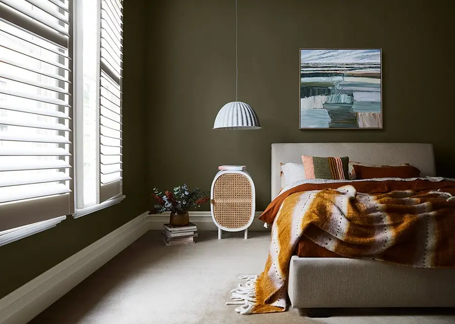
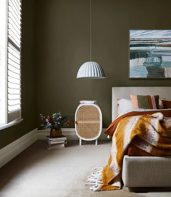
We spend most of our lives in a digitally saturated environment. Nourish encourages us to unplug and be present in the moment. Indulge in a nurturing palette that revitalises your home and nourishes the soul. Katie Wyatt Artwork via Greenhouse Interiors Colours featured: Dulux Olive Blend (walls) and Dulux Marton (trim).
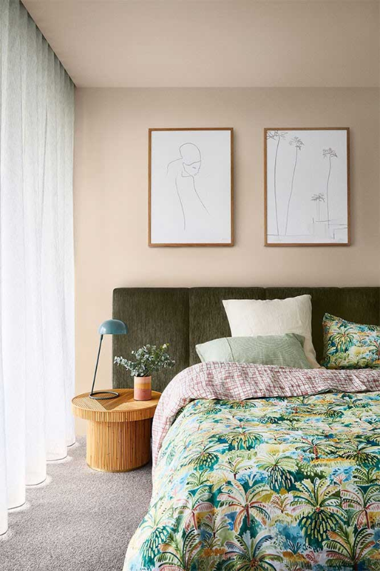
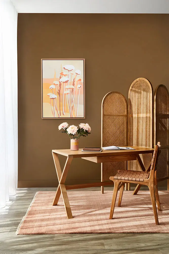
A renewed palette of warm neutrals inspires fresh interest by adding accents of yellow and green.
Appreciate natural beauty
Nourish draws on nature to hero tactility and the need for comfort. It looks to rounded forms and soft objects to blend the identity between decor and furniture.
With a renewed appreciation for natural beauty – complement your home with simple, textural and nurturing hues and admire your tranquil surrounds.
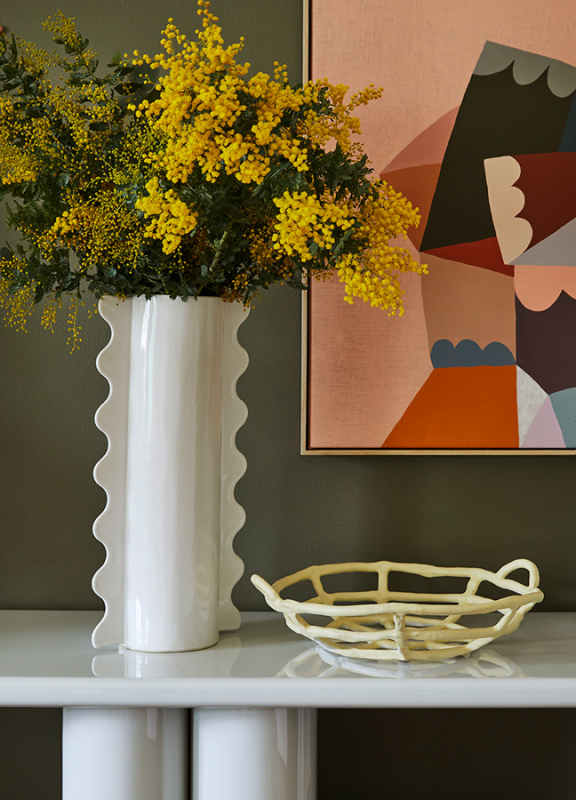
'Little Vase' artwork via Castle and Things.

Scheming with a soft, natural hue such as Dulux Sandymount creates a calming and flexible colour palette. Layer with textures and add earthy tones to complete the look.
The influence of timber against soothing colours provides a balancing rustic feel, whilst lighter furnishings allow for a more playful use of colour.


The Nourish palette
Warm neutrals and accents of yellow and green inspire a desire for plants and blooms.
Order samplesCreating the look you love with the right palette for your home.
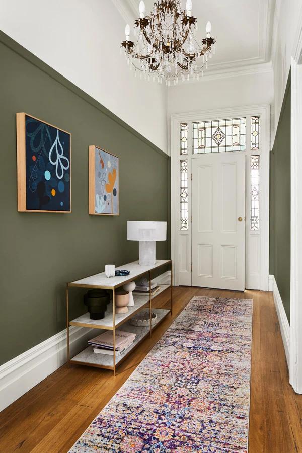
Three ways to refresh your space using Reset, Nourish and Retreat for the entrance.
Reset with elegant vintage style
Create a restorative entrance with contrasting Morikau and Cardrona with subtle hints of green.
Plants and botanicals complement this interior, using their beauty to rejuvenate our wellbeing.
'Muted Reflection' Artwork by Doulene Walker via Greenhouse Interiors


Disclaimer
Colours displayed should be used as a guide for your colour selection. To ensure best accuracy, test your colour choice at home by ordering Dulux Sample Pots and A4 Colour Swatches.

