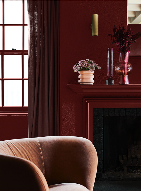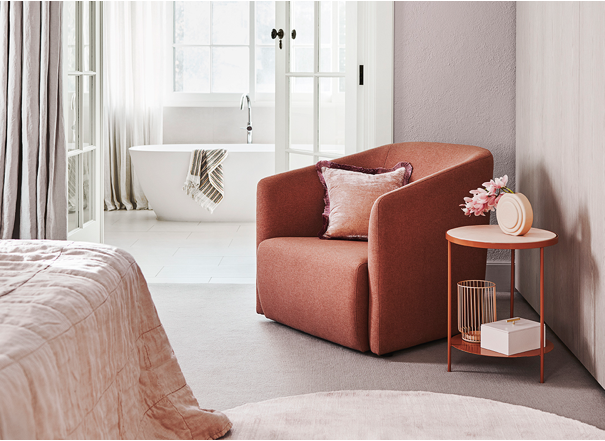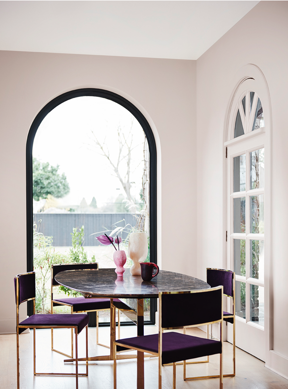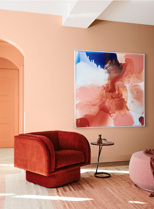
Dreaming of an escape? Indulge speaks to our collective desire to disconnect from the mounting challenges of the everyday. It’s the perfect antidote to our busy, high-stress lives, finding the rose-tinted glasses to reignite our romance with hearth and home. Lilac Moon IV, original print by Ellie Malin
Indulge is the luxurious antidote to our busy, stressful lives
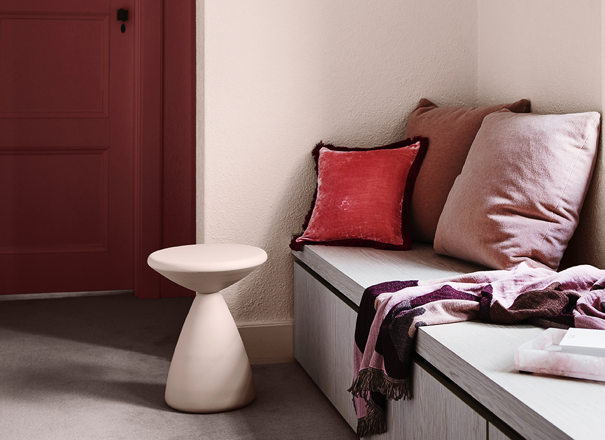
Cocoon yourself in comfort with rich layers of luxurious fabric and decadently rounded forms. Soften hard surfaces with an abundance of fringing, chenille and velvet.
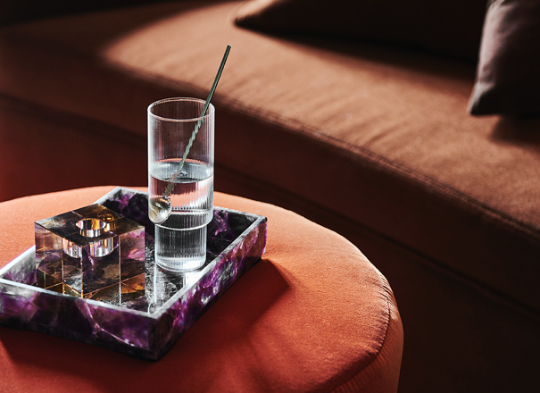
Selecting a decadent colour, such as a rich red or earthy brown, can add an essence of sophistication, and the feeling of connection and security in the space.
A warm, vivid sunset palette
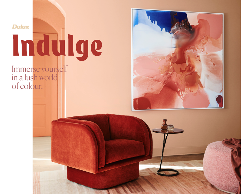
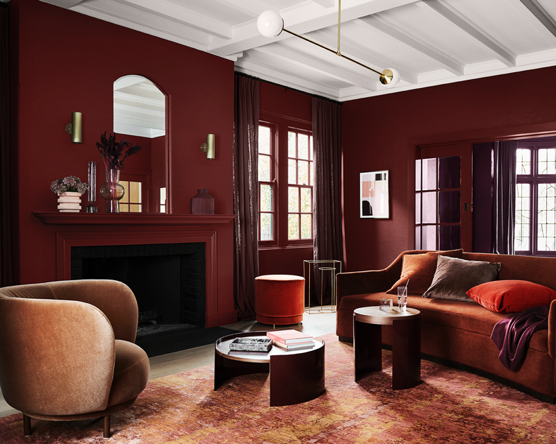
A warm, vivid sunset palette helps to create an emotive space designed for lingering. Focus on toasty shades of burgundy, brown, reds and oranges to create a cosy, indulgent place to escape.
A scheme perfect for intimate rooms
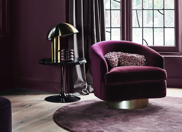
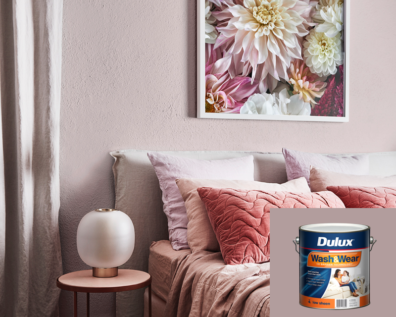
Hints of Art Deco and 70s retro-futurism add moments of nostalgia to high romance. Create a scheme that’s perfect for intimate rooms of your home. Start with a lilac infused pastel and balance its lightness with deeper shades in your textiles and decor.
Evoke a sense of nostalgia
Combine this rich colour palette with decadently rounded forms and a new interpretation on 1970s retro-futuristic style to clash with opulent Art Deco vibes. Jewelled colours help to evoke a sense of nostalgia. Play with deeper purples and ruby reds to create a luxurious appeal.
Create a sense of belonging
Hard facts and raw truths, for just a moment, are hidden from view as we immerse ourselves in a lush-coloured world of our own making, filled with joy, love and a sense of belonging.
Indulge palette
Sink into a rich and soothing palette of melon, salmon, brown, red and cosmetic tints. It’s the perfect combination to create an immersive and opulent interior.
Order sample potsIndulge Gallery
Get the look with the Indulge trend
The Dulux Colour Forecast is about more than colour, it helps bring trends to life in your home through styling and accessories. Here we take you through key elements and styling tips for the Indulge trend.
Opulent details and fabrics, such as chenilles and velvets, are commonplace, alongside fringing, layered drapery and overlapping rugs with carpeted floors.
Wall
Pukehina
Orange can radiate warmth and energy and is quite stimulating and thought provoking. Orange is available in many shades and tones. Burnt orange looks great in formal areas and the lighter orange shades of apricot or peach work beautifully in bedrooms and living spaces.
Indulge trend
Utilising hues from the same colour family creates an immersive tonal colour palette. Ensure your colours appear exactly as planned by always using Dulux pigments mixed into Dulux Wash&Wear ® paint.
Bring the essence of our 2020 trends to your home using Dulux Wash&Wear®. Only our formulas are designed to create the iconic colours shown here every time. Artwork: 'The Masters Light Dahlia' by Helen Bankers.
For more details on the products and colours featured in our Dulux Colour Forecast 2020, download our digital magazine.
More from Dulux Colour Forecast 2020
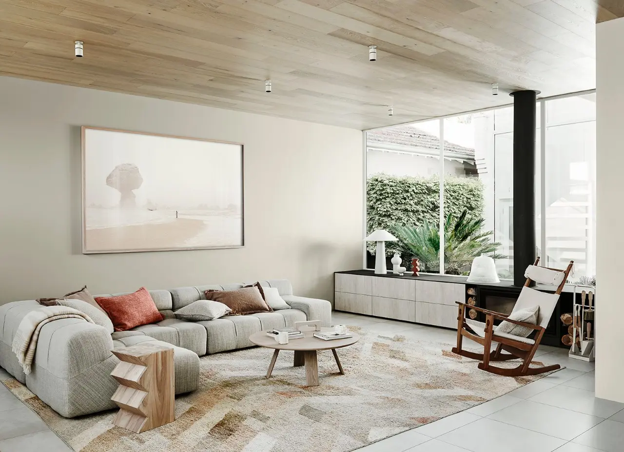
This warm neutral palette sees elements of white through to caramel unite with muted lavender.
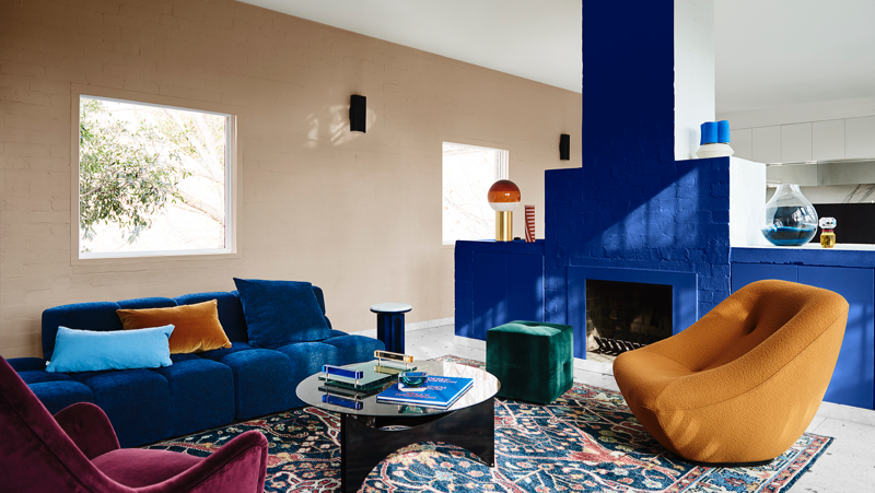
Tonal blues draw inspiration from the early twentieth century, while warm hues accentuate elegant vintage style.
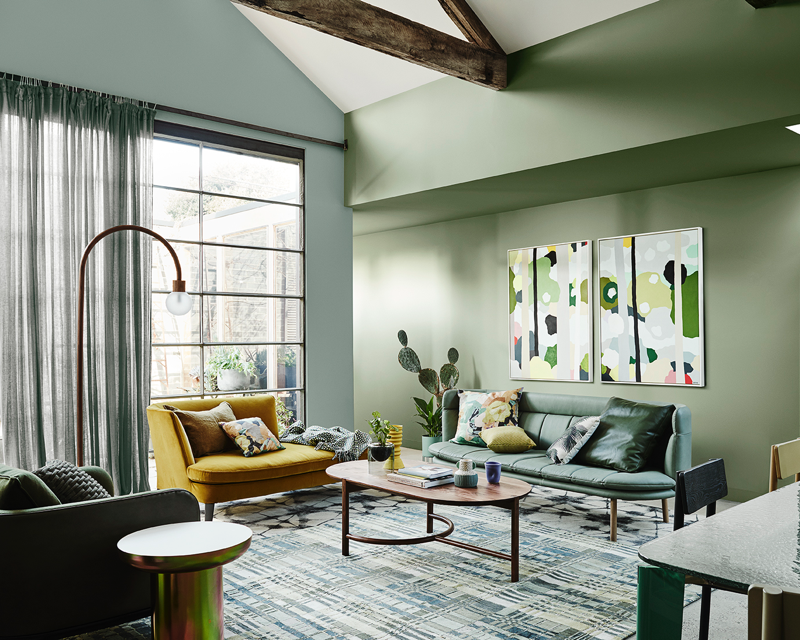
Tonal greens are interspersed with uplifting pops of chalky blue, deep plum and yellow curd.
Disclaimer
Colours displayed should be used as a guide for your colour selection. To ensure best accuracy, test your colour choice at home by ordering Dulux Sample Pots and A4 Colour Swatches.
