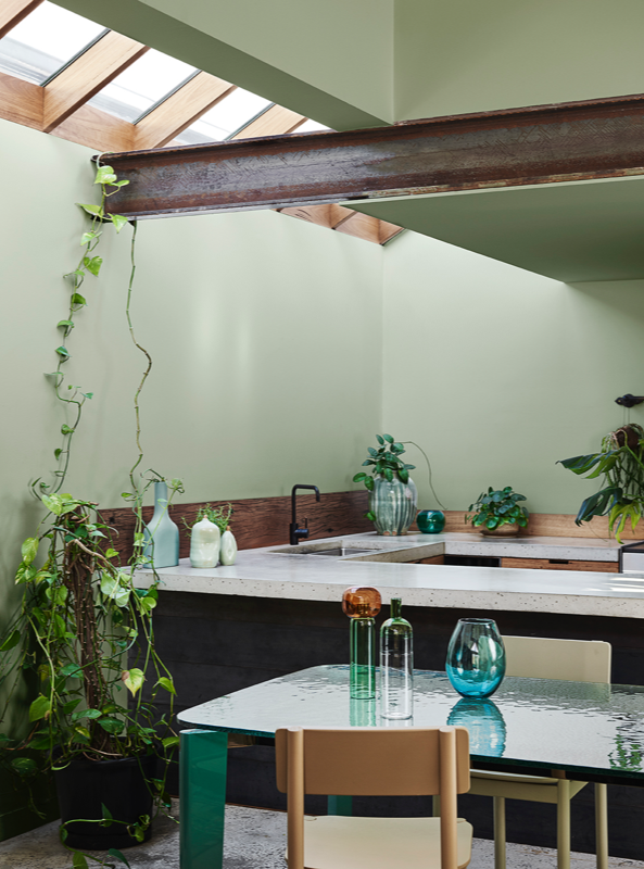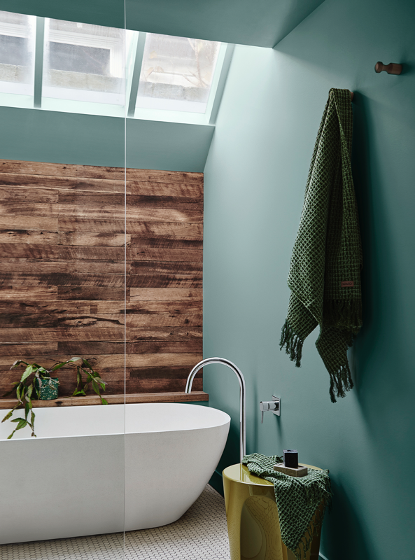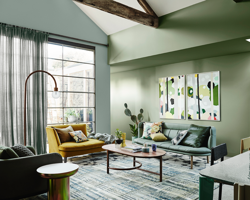
The time has come to nurture and regenerate. To surrender to that urge for escape and to find refuge in the beautiful simplicity of nature. As we disconnect from the harsh white filters of the digital sphere, reconnect with the elements of nature: verdant earth, clean air, natural light. Featured: 'Peering in (Canopy)', original artwork by Clare Brodie. Colours featured: Pencarraw and Te Aroha
Cultivate’s nature-inspired palette combats the crush of city living with its soothing calmness
Rejuvenate and Inspire
Home is no longer a place to rest and recover, it's somewhere to rejuvenate and inspire. We seek out innovative ways to bring elements of the natural world into our interiors to encourage personal growth. The Cultivate palette is a calm and gentle layering of greens that reinforces our connection to nature.


Living with green in your home is such a refreshing thing to experience. The ambience is soothing and restful, perfect for combatting the chaos of the modern world.
Embrace slow living
In Cultivate we embrace the romance of slow living, taking pleasure in nature and our ability to nurture, grow and sustain ourselves in simple and small ways. Colours displayed should be used as a guide for your colour selection.
Personal wellbeing
Personal wellbeing comes to the fore and we seek out the soothing, calm refuge of home where we can rest, re-focus and regenerate. Harmonious influences see modern Japanese minimalism blend with natural green hues offset by enlivening plum and uplifting yellow.
Feature Japanese styling cues
Feature subtle Japanese styling cues such as black stained timber, handmade ceramics or origami-like textile prints.
Connect to nature
Cultivate connects us to nature through colour and pattern, while reminding us to appreciate the simple things – beautiful botanicals, fresh air and natural light.
The Cultivate Palette
The tonal greens of Cultivate are inspired by nature. These are interspersed with uplifting pops of chalky blue, deep plum and yellow curd – the perfect contrast.
Order sample potsGallery
Get the look with the Cultivate trend
The Dulux Colour Forecast is about more than colour, it helps bring trends to life in your home through styling and accessories. Here we take you through key elements and styling tips for the Cultivate trend.
Embrace a mix of Japanese patterns
Embrace a mix of Japanese patterns inspired by botanical motifs, traditional florals and origami folds. Layer your rugs and textiles with a common theme to create an interesting feature.
Trend of transparency
We see the trend of transparency emerging as a strong direction in design. The use of coloured glass or recycled coloured plastics is uplifting and optimistic. They capture an abundance of light to give the appearance of weightlessness.

Wall
Te Aroha
A natural mid-base grey green that is perfect for both interior and exterior walls and highlights. Te Aroha is a beautiful match for the warm of timber.
Bring the essence of our 2020 trends to your home using Dulux Wash&Wear®. Only our formulas are designed to create the iconic colours shown here every time.
For more details on the products and colours featured in our Dulux Colour Forecast 2020, download our digital magazine.
More from Dulux 2020 Colour Forecast
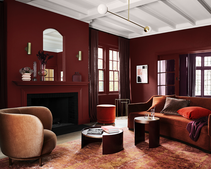
This rich and soothing palette features luxurious melon, salmon, brown, red and cosmetic tints.
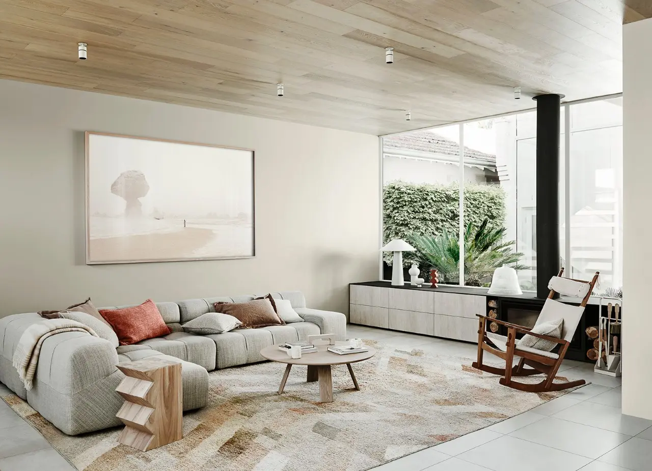
This warm neutral palette sees elements of white through to caramel unite with muted lavender.
Tonal blues draw inspiration from the early twentieth century, while warm hues accentuate elegant vintage style.
Disclaimer
Colours displayed should be used as a guide for your colour selection. To ensure best accuracy, test your colour choice at home by ordering Dulux Sample Pots and A4 Colour Swatches.


