Colour Forecast 2018
Escapade
Pack your suitcase, don your tropical prints and get ready for a holiday to remember. Dream destinations are just a plane ride away. Adventure and discovery hover on the horizon and as our imagination takes flight, we find excitement and escape in the most unexpected of places.
The quest for fun and adventure
The glamour of travel is conjured through designer luggage and free-spirited selfies. While luxury could be anything from a hot Brazilian beach to a stylish Palm Springs spa. As we kick back and prepare to take off, we let our dreams run wild, paradise awaits – both on home shores and beyond.
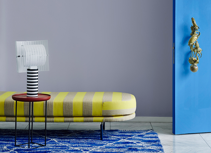
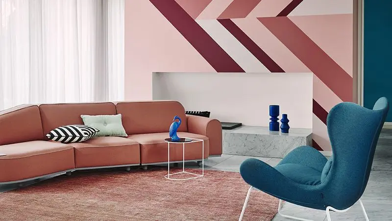
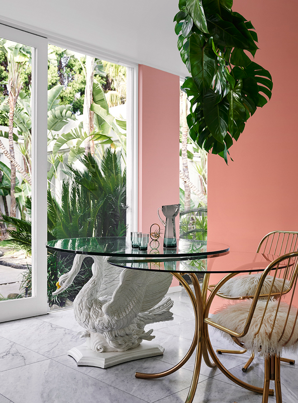
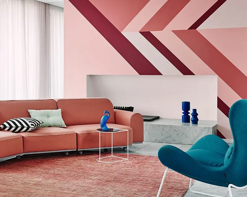
Don't be afraid to mix up the decades
Organic shapes are offset by solid forms in a playful blending of styles. Don’t be afraid to mix up your decades with '70s and '80s references and take a chance on unexpected colour combinations.
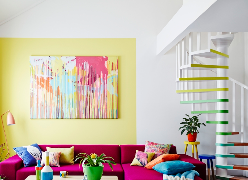
Tones of pale mint, teal and blue promise plenty of light-hearted fun. Bursts of mustard yellow cut through the tonal colour effect. Shades of pink range from pale and soft to saturated and bold.
Creating a '70s inspired geometric feature with one hue in varying shades allows you to add fun bold colours in interesting accessories. Paint your flea market finds to suit your colour scheme and mix them with new accessories.
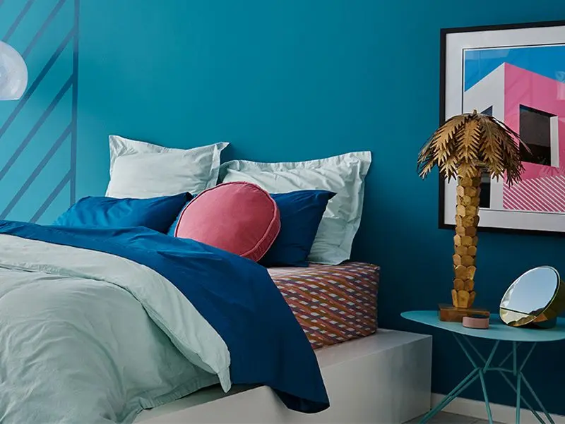
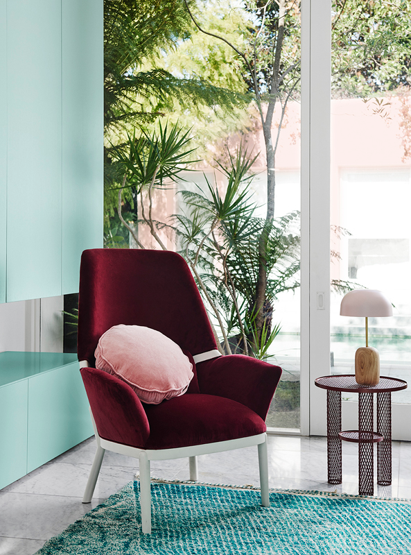
Tropical botanicals add a lively touch to bold colour schemes. Get creative with tropical leaves – they last a long time and, using a floristry trick (such as oasis), you can create green displays like this hanging chandelier.
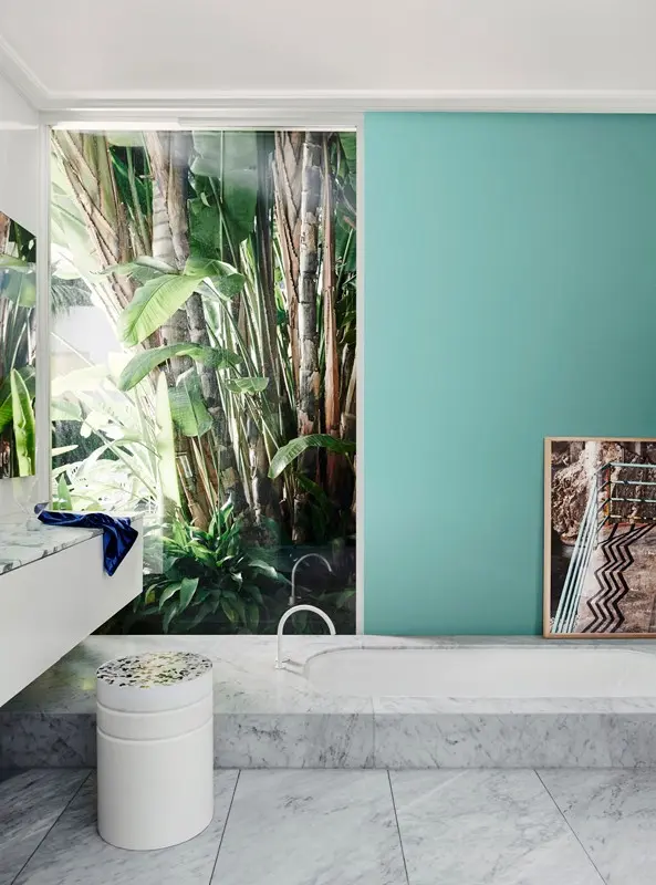
Tropical outlooks require little embellishment. Keep the look fresh with cooler shades of green against the beauty of marble and accent with small amounts of bold blue in accessories.
For more details on the products and colours featured in our 2019 colour trends, read our digital magazine.
Gallery
Most Loved Whites + Escapade
Dulux has been crafting some of New Zealand's iconic paint colours for over 80 years. Here’s how our Most Loved Whites and Neutrals can work in harmony with the Escapade palette.
Dulux Mt Aspiring Half
Warm white with a subtle greyish hint, Dulux Mt Aspiring Half marries well with rich, warm colours. Create visual highlights and focal points in your home by combining it with Dulux Friends and Carmen from the Escapade Palette.
Dulux Southern Alps
The clean elegance of Dulux Southern Alps gives you a great blank canvas for building your dream colour scheme. To refresh and revitalise your spaces, team Dulux Southern Alps with the deep ocean blue of Dulux Sir Edmund, or Dulux Waitiki Landing.
Suppliers
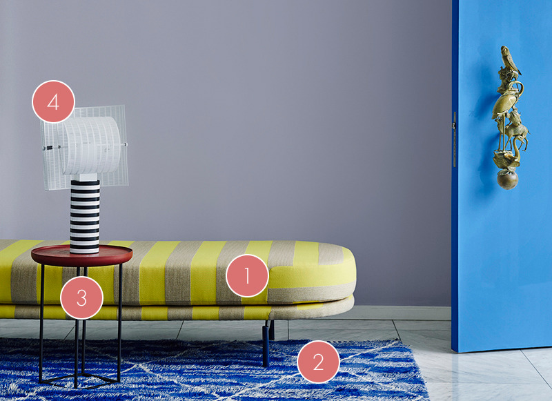
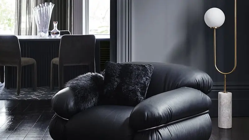
Ari Daybed, Something Beginning With 2. Beni M’rirt 2 Rug, Halcyon Lake 3. Torei low table by Luca Nichetto for Cassina, Space Furniture 4. Shogun Table Lamp by Mario Botta, Artemide
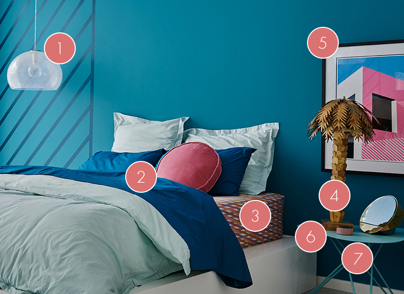
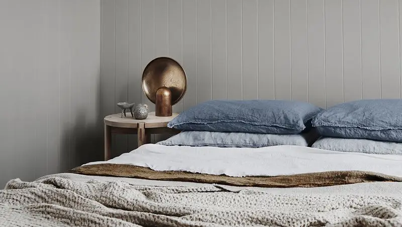
Big FL/Y Pendant light by Ferruccio Laviani for Kartell, Space Furniture 2. Eldon Mist Quilt cover set & matching Euro pillowcases with Eldon Indigo flat sheet, Linen House 3. Lattice Biscuit Fall fitted sheet & Velvet Pea Cushion, Kip & Co 4. HK Living Brass Palm Lamp, House of Orange 5. ‘SE15’ Artwork, Ben Craven 6. AYTM Gutta Mini Rose Mirror & Iron Jewellery Box & Kristina Dam Brass Mirror Sculpture, Designstuff 7. Tio Side Table in Pastel Turquoise by Massproduction, District
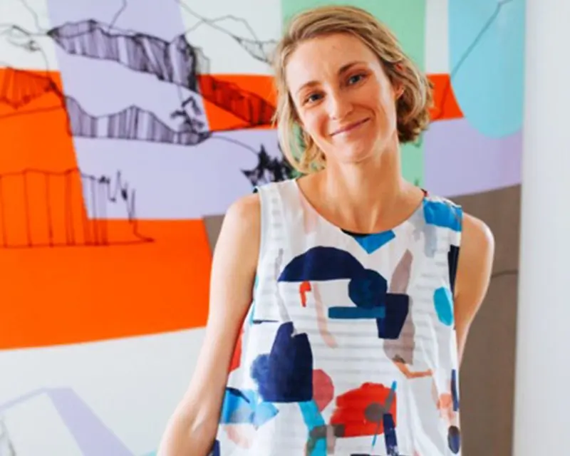
Create the look: Escapade
I love an element of surprise, so I’ve clashed patterns and geometric shapes, and played with scale to create a playful and exciting look.
I’ve brought the outdoors in with indoor plants, used colourful artwork and a green feature wall to channel that vibrant, happy feel.
Pip Brett jumbledonline.com
Disclaimer
Colours displayed should be used as a guide for your colour selection. To ensure best accuracy, test your colour choice at home by ordering Dulux Sample Pots and A4 Colour Swatches.